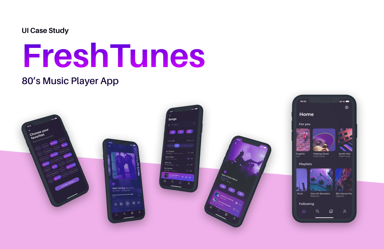
Fresh Tunes
FreshTunes is the creation of an immersive 80s music player mobile app. This case study revolves around designing a user-friendly and visually captivating app that encapsulates the nostalgia and magic of the iconic decade.
My Process
Context
Creation of an 80s music player app, with designs inspired by the art and culture of that time. While the collaboration with stakeholders was hypothetical, the project was approached with a professional mindset to meet the defined design requirements and deliver a seamless user experience targeting primarily 35 to 55-year-old music enthusiasts.
Objective
The main goal of this project is to design a captivating UI for the 80s music player mobile app while adhering to the specified design requirements. The end product will be prepared for seamless handover to developers for implementation, ensuring a smooth transition from design to functionality.
Key Functionalities
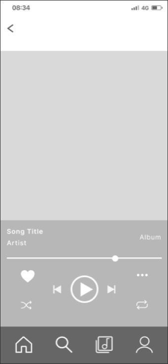
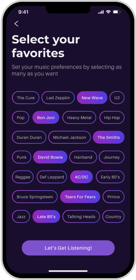
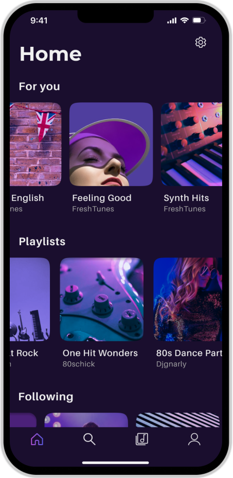
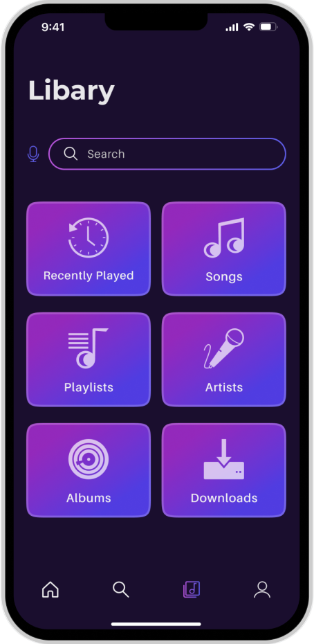
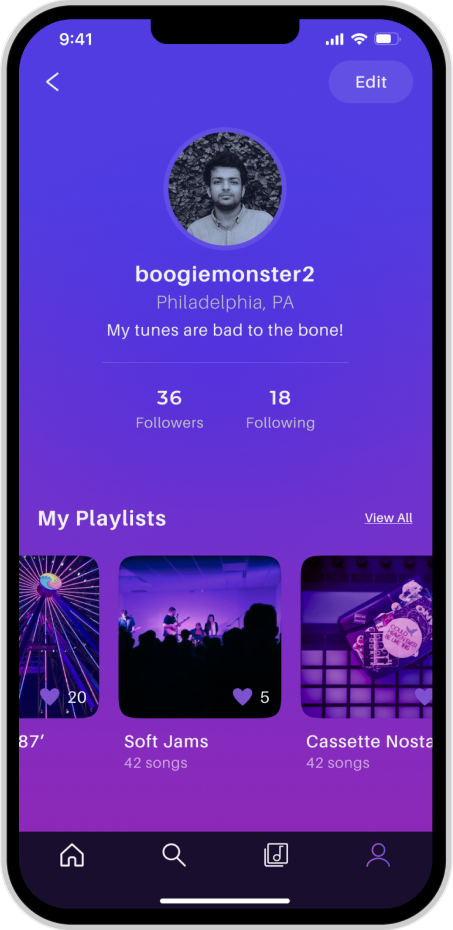
- Create a profile
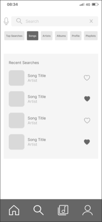
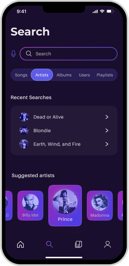
- Search for new artists
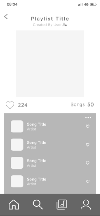
- Create a playlist
Design Requirements
The design of FreshTunes was guided by a set of specific requirements to ensure a user-friendly and visually appealing interface. The following design requirements were provided in the project brief:
Appropriate and consistent spacing of elements
to ensure a balanced and harmonious layout.
Appropriate use of mobile design patterns
to enhance user familiarity and ease of navigation.
Clear and effective visual hierarchy
to guide users' attention and aid in content comprehension
Icons communicate the actions they represent and have a consistent style
to effectively communicate their respective functions while maintaining a consistent visual style.
Consistent use of known UI elements
to enhance usability and reduce user learning curves.
Clearly defined typographic hierarchy
to establish a clear typographic hierarchy for headings, body text, emphasis text, content lists, and button text.
An appropriate color palette is used in the UI
to evoke the desired mood and enhance user engagement.
All placeholder copy replaced with real copy
to ensure a seamless user experience.
Designs must be for iPhone 8 or iPhone 11 screens
to ensure compatibility across popular mobile devices (at the time of project creation).
Content aligned with a well-defined grid system
to maintain visual consistency and organization.
Competitor Analysis
To create a successful app design, comprehensive research was conducted by analyzing established competitor apps in the music genre, such as Spotify and SoundCloud. Valuable insights were gleaned from examining their design principles, usability heuristics, and user interface patterns. These insights played a pivotal role in informing my design decisions for FreshTunes, as I strategically selected and applied relevant UI design patterns to address specific design challenges.
Spotify
Spotify's design emphasized error recognition and recovery while effectively utilizing Gestalt principles for grouping diverse media types, allowing users to easily organize and explore their favorite music. The app employed data management, social, and feedback patterns to enhance user interactions.

SoundCloud
SoundCloud showcased consistency and rhythm in its UI design, using recognizable icons and subtle shape outlines for playlist covers. The app creatively utilized reification to engage users with appealing illusions. Its UI patterns encompassed gathering input, seamless navigation, and miscellaneous functions for membership management.
Integration into FreshTunes
Integration of new features included song-specific functionalities like queuing, favoriting, and downloading, as well as social features such as music sharing, user following, and playlist browsing. Users can also customize their music preferences by selecting genres, artists, or particular decade periods. These additions were implemented using a variety of UI patterns, including feedback, social, navigational, gathering input, and miscellaneous patterns.

Low-Fidelity Wireframes
The low-fidelity wireframes are initial blueprints that outline the basic design concepts for FreshTunes. They provide a simplified representation of the app's layout, content, and user interactions, serving as a foundation for the high-fidelity design. These wireframes enabled me to explore design possibilities and ensure a user-centric interface.
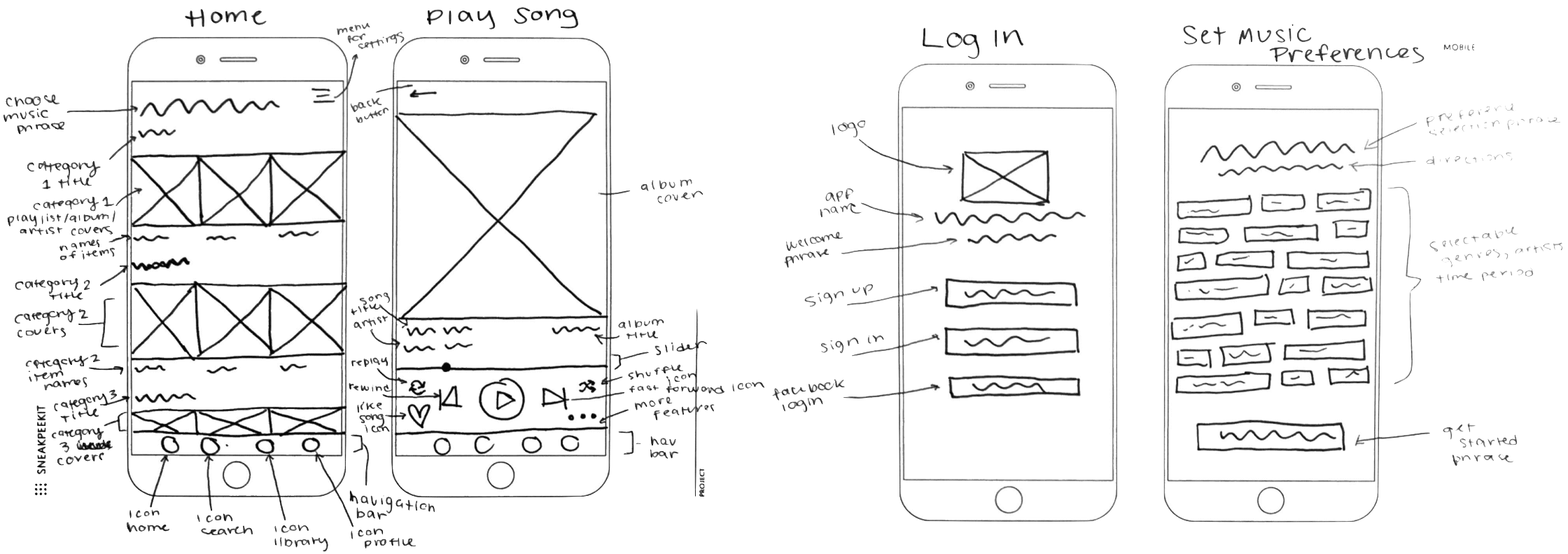
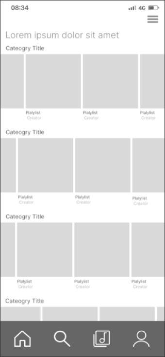
Mid-Fidelity Wireframes
The mid-fidelity wireframes add detail and visual elements to the low-fidelity designs, providing a clearer representation of the app's structure and interactions. They bridge the gap between low-level sketches and high-level visuals, allowing for clearer layout direction and visual hierarchy.
Design Process
In this phase of the design process, the focus was on refining the user interface of FreshTunes to create an engaging and visually appealing experience. By incorporating principles of layout design, spacing, and visual hierarchy, I aimed to ensure consistency and user-friendly navigation throughout the app.
Layout Design & Spacing
- Optimized the layout of wireframes, including header, footer, and whitespace considerations.
- Ensured consistent spacing increments for key elements across screens.
- Annotated wireframes with spacing increments were used.

Grid System
- Defined and customized an 8-column grid for the wireframes.
- Ensured all elements were aligned to the grid and presented a consistent layout.
- Note: Screens were later adapted for a more current device, the iPhone 14 Plus, using a 12-column grid.
UI Elements & Hierarchy
- Added more detail to wireframes with relevant UI elements.
- Established a clear visual hierarchy using grayscale wireframes.
- Annotated wireframes to explain the thought process behind the visual hierarchy.

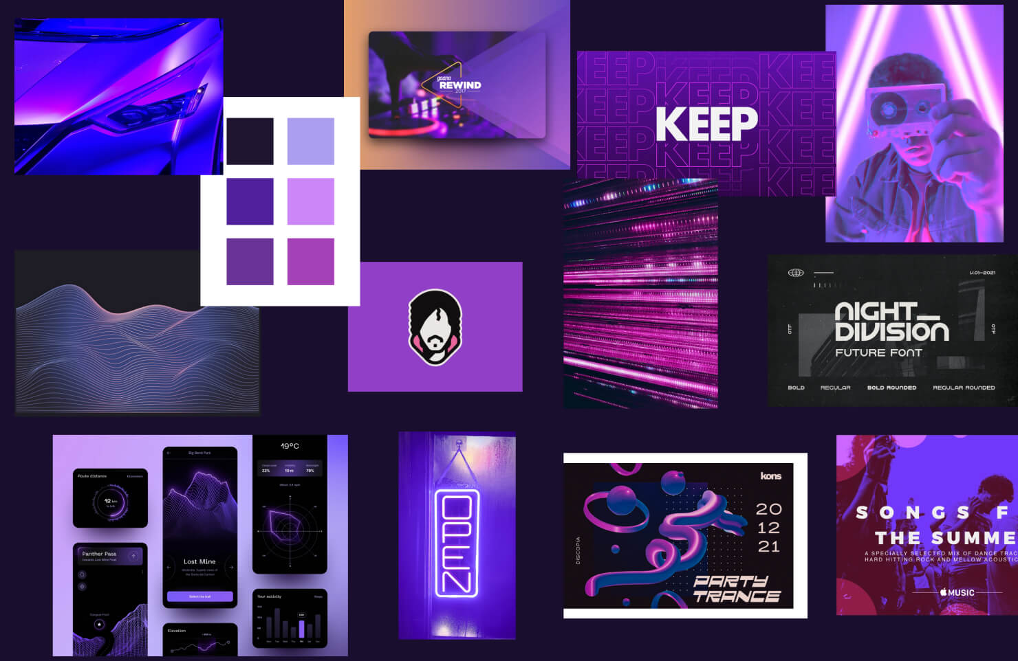
Moodboard
The mood board captures the essence of the app's visual direction, reflecting the vibrant and nostalgic vibes of the 80s era. Through a carefully curated collection of colors, typography, imagery, and quotes, the mood board sets the tone for the app's user interface, evoking a sense of nostalgia and excitement for the target audience.
Style Guide
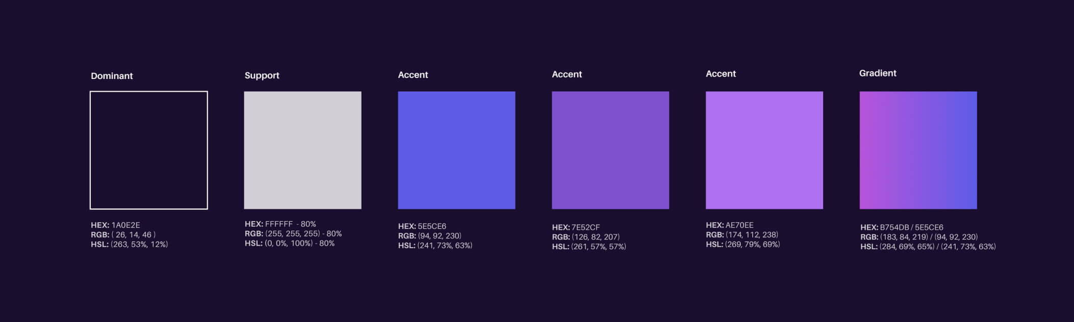
Colors
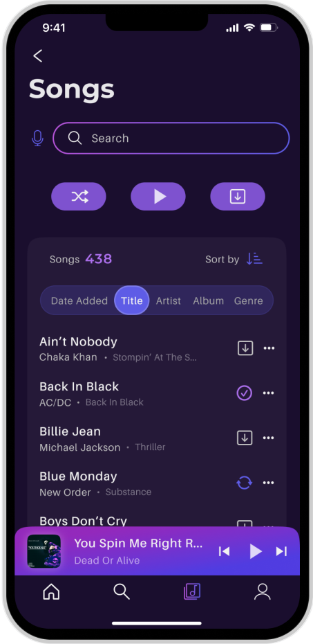
The carefully curated color palette for the app embodies the nostalgia, energy, and modernity of the 80s era, resonating with the target audience and enhancing their musical journey. With a harmonious blend of vibrant hues and a well-designed linear gradient, the colors create a visually appealing and user-friendly interface, providing an engaging and immersive music player experience.
- The deep indigo hue evokes nostalgia and sets a vibrant tone, capturing the spirit of the iconic decade.
- Complemented by the energetic electric purple and vibrant violet, the color scheme infuses excitement and personality into interactive elements, guiding users toward key actions and enhancing the overall user experience.
- The addition of the soft pastel lilac brings a harmonious balance, ensuring a cohesive and modern look.
- The carefully curated linear gradient further elevates the app's visual appeal, creating a smooth transition between vibrant violet and electric purple in specific app sections.
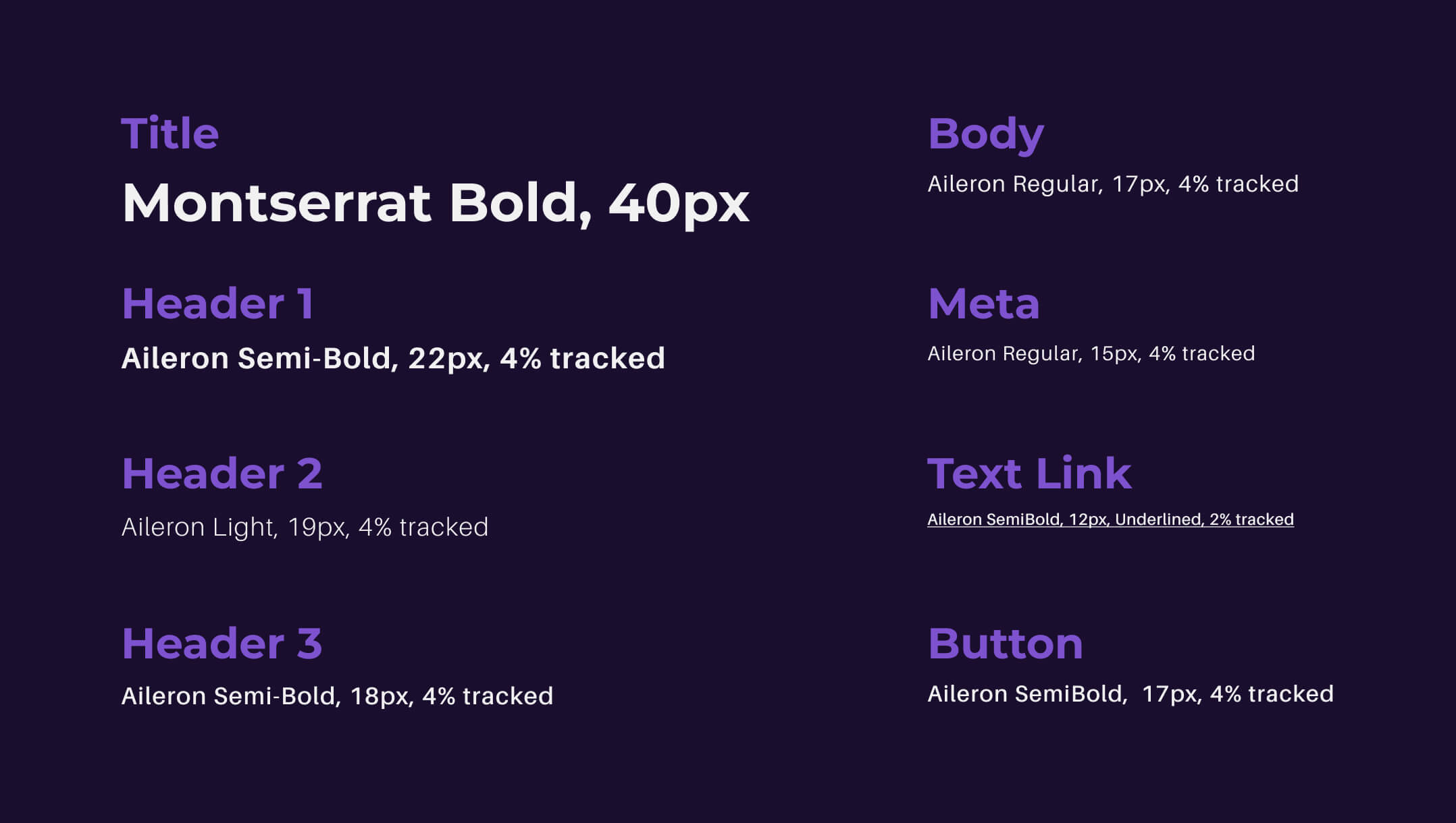
Typography
In crafting the text styles for the 80s music player app, deliberate choices were made to ensure a cohesive and captivating visual language. Montserrat Bold, with its strong and bold presence, was selected for the titles, exuding a sense of confidence and prominence. Meanwhile, Aileron strikes a perfect balance for the body text and headers, providing a clean and legible reading experience while maintaining a touch of elegance.
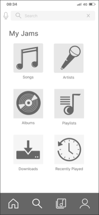
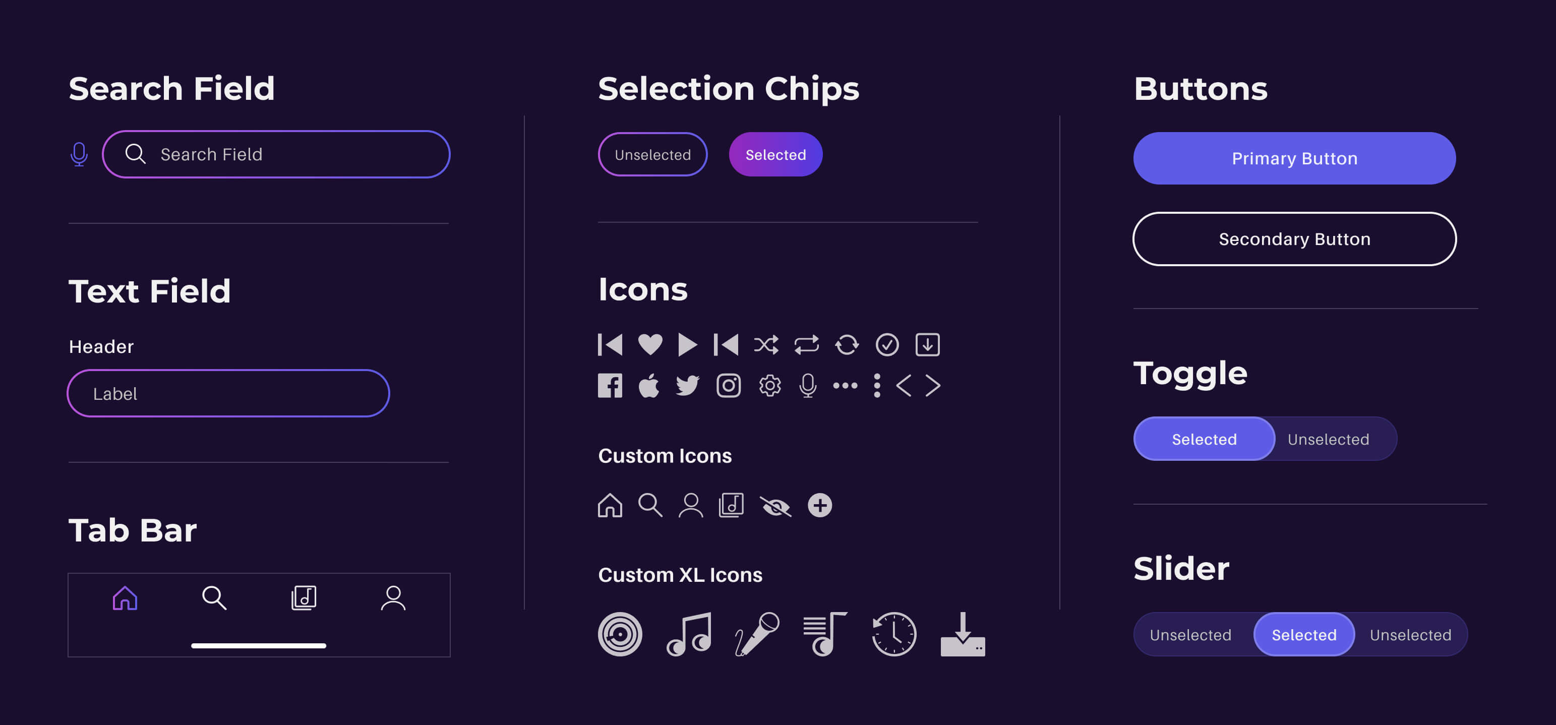
UI Elements & Components
The creation of custom icons, UI elements, buttons, and components played a pivotal role in shaping the distinctive personality of the 80s music player app. Meticulously designed to align with the app's overall aesthetic, these elements elevate the user experience by infusing a sense of nostalgia and fun.
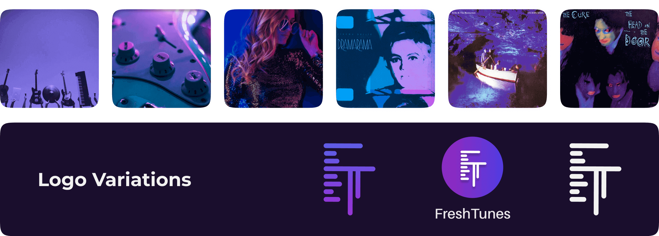
Imagery
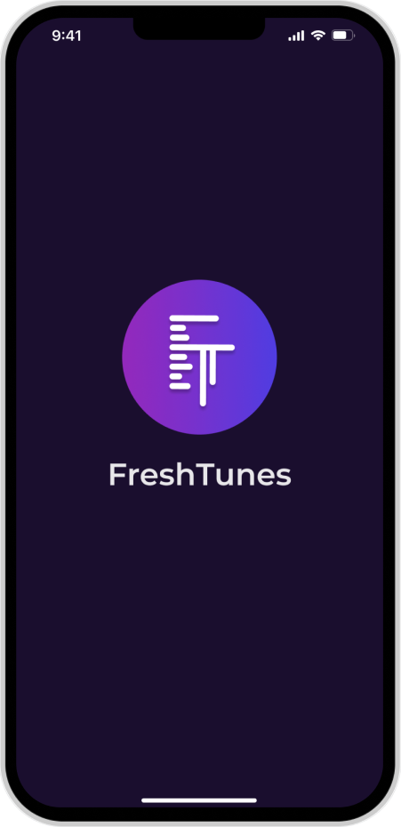
The imagery showcases the captivating visual storytelling of FreshTunes. Along with my custom-designed logo that incorporates the letters 'F’ and ‘T' into an equalizer, the app's visual language captures the essence of the era while complementing the overall UI design. Alongside iconic album covers, pink, blue, and purple neon-inspired graphics, and vibrant illustrations, this carefully curated imagery creates a delightful and memorable experience for the users, immersing them in the vibrant world of 80s music.
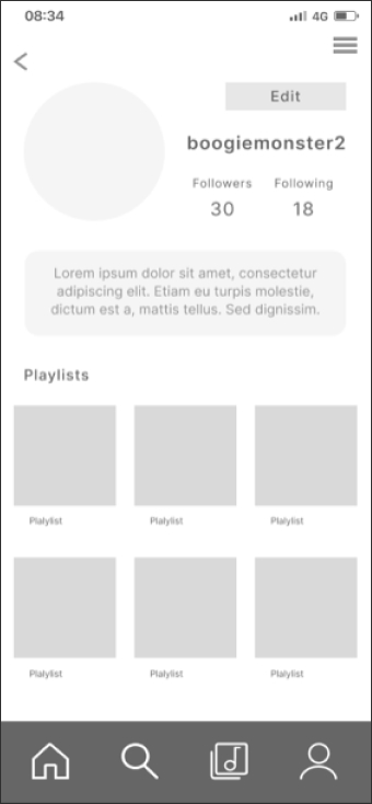
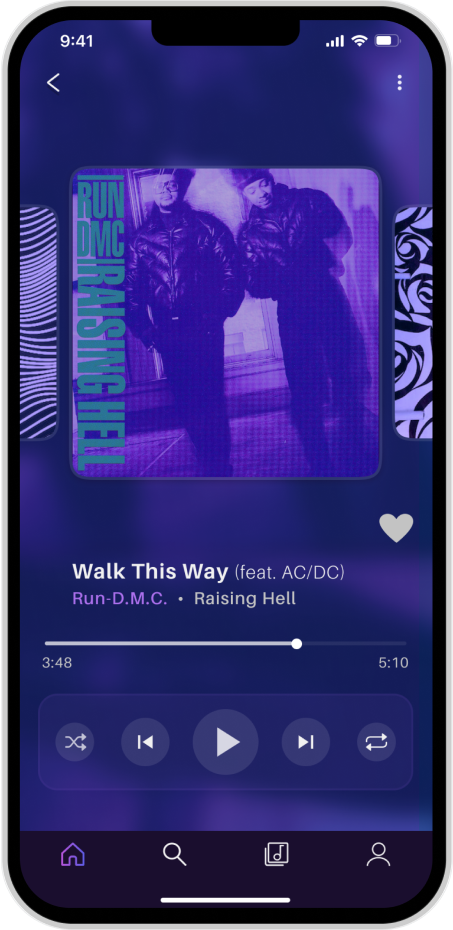
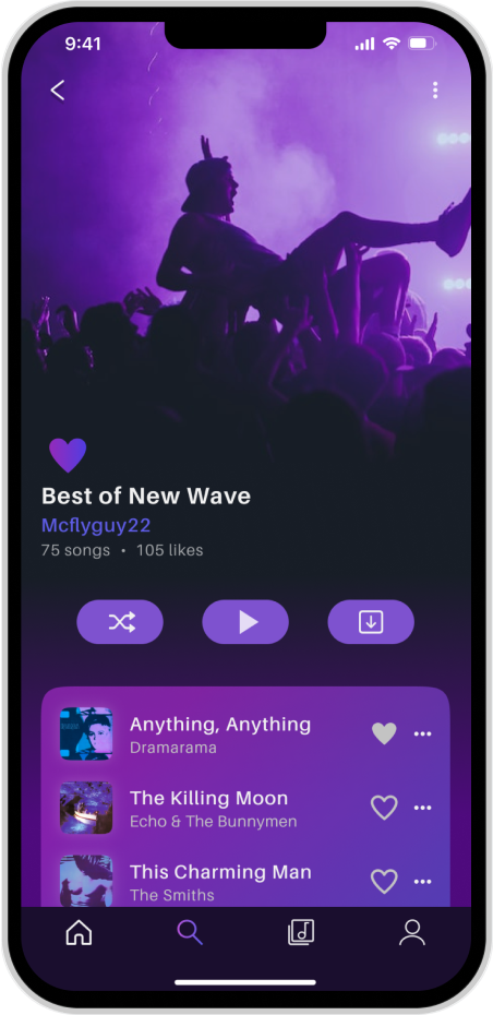
Final Designs

Handoff to Developers
For the final step of the project comes the seamless handoff of design assets and resources for FreshTunes to the development team. The objective is to ensure that developers have all the necessary tools and information to implement the UI design accurately and efficiently.
Design Assets and Formats
All design assets, including finalized UI designs, low and mid-fidelity wireframes, custom icons, typography stylesheet, color palettes, and imagery, have been thoughtfully prepared and organized. Each asset is available in the appropriate formats, such as PNG files at various resolutions for images, SVGs for icons, and a well-structured Figma file with logically labeled elements.
Documentation and Rationale
Detailed documentation of the design decisions and rationale is included to provide developers with valuable insights into the UI design process. This documentation serves as a reference to maintain the design integrity during development and ensures a clear understanding of the user experience and interface interactions.
Reflection & Learnings
FreshTunes, the 80s Music Player App, aptly fulfills the project's objective by delivering a user-friendly and visually captivating design. Key functionalities, including profile creation, artist search, and playlist-making, are seamlessly incorporated, while additional features enhance the overall user experience.
The creation of custom icons proved enjoyable, but developing the grid system posed challenges that I overcame through research and mentor guidance. Throughout the project, I learned to embrace the iterative design process, gaining valuable insights into refining and perfecting the app's UI. If given the opportunity, I would focus on improved time management and utilize breaks for a more productive workflow.
In summary, FreshTunes represents a rewarding project that showcases my growth in design skills and dedication to creating a cohesive and engaging app for 80s music enthusiasts.
As I conclude my FreshTunes case study, I see potential opportunities for future enhancements that could elevate the app's user experience even further. To take this UI design to the next level, I plan to prototype it with interactions and animation.
I want to extend my sincere gratitude to my mentor and tutor who provided valuable feedback throughout this design journey. This project allowed me to gain a deeper understanding of UI/UX principles, pattern incorporation, and the importance of visual storytelling. The valuable lessons learned from overcoming challenges and embracing the iterative design process have enriched my design skills and fueled my passion for creating user-centric experiences. FreshTunes has been an exciting project, and I am thrilled to have contributed to the world of 80s music in the digital era.