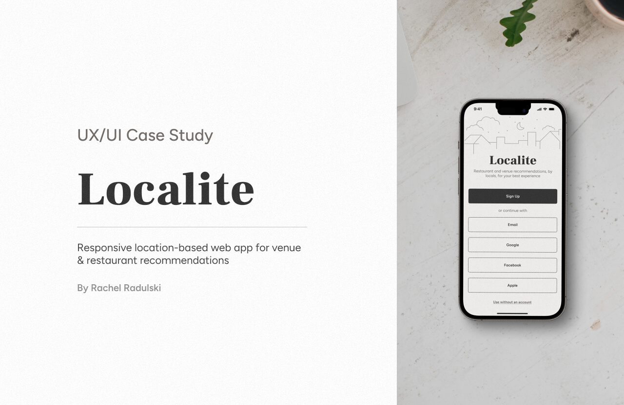
Localite
Localite is a responsive location-based app aimed to help users discover new restaurants and venues and share their experiences. With a focus on authentic local recommendations users can find the best restaurants, cafes, bars, and more.
My Process
Objective
Design a responsive web app for location-based recommendations that meets the requirements of its users and solves the problems they face with existing location-based recommendation apps.
Target Audience
Young adults (18 - 35 y.o) users of location-based recommendation apps, who want to effectively discover new venues to visit, without experiencing the problems they encounter when using existing apps. This age group was selected due to research showing an increased interest in traveling since 2020 for this age range.
Hypothesis
An app that utilizes locals' ratings and commentary to populate venue recommendations can improve user trust due to word-of-mouth psychology. By incorporating a social media aspect that enables users to share recommendations with friends and followers, the app can further engage its target audience.
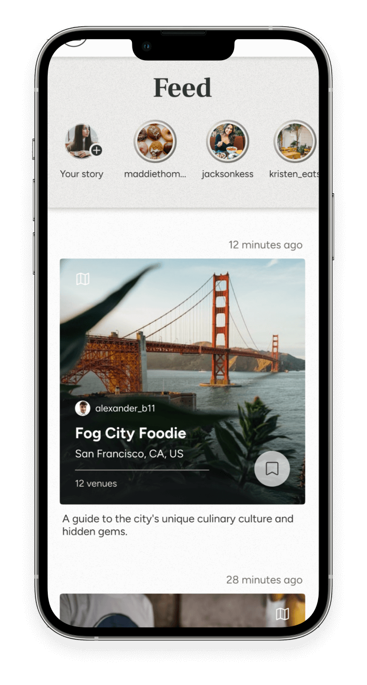
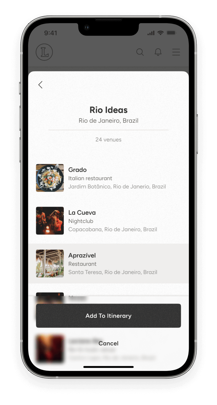
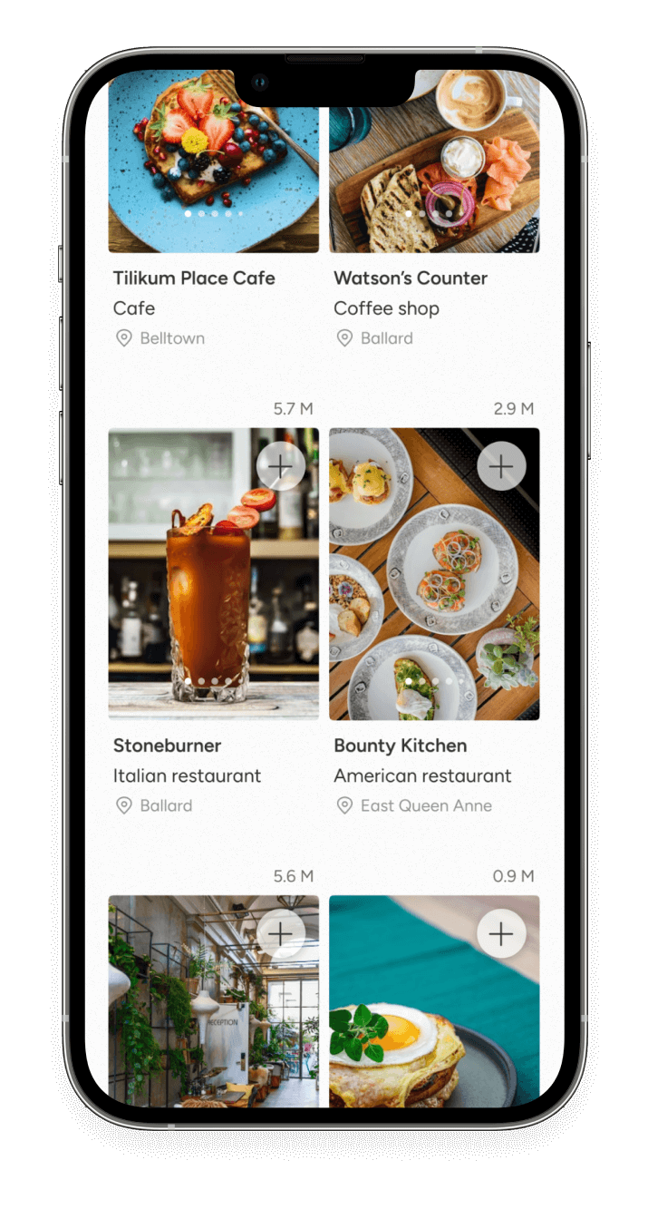
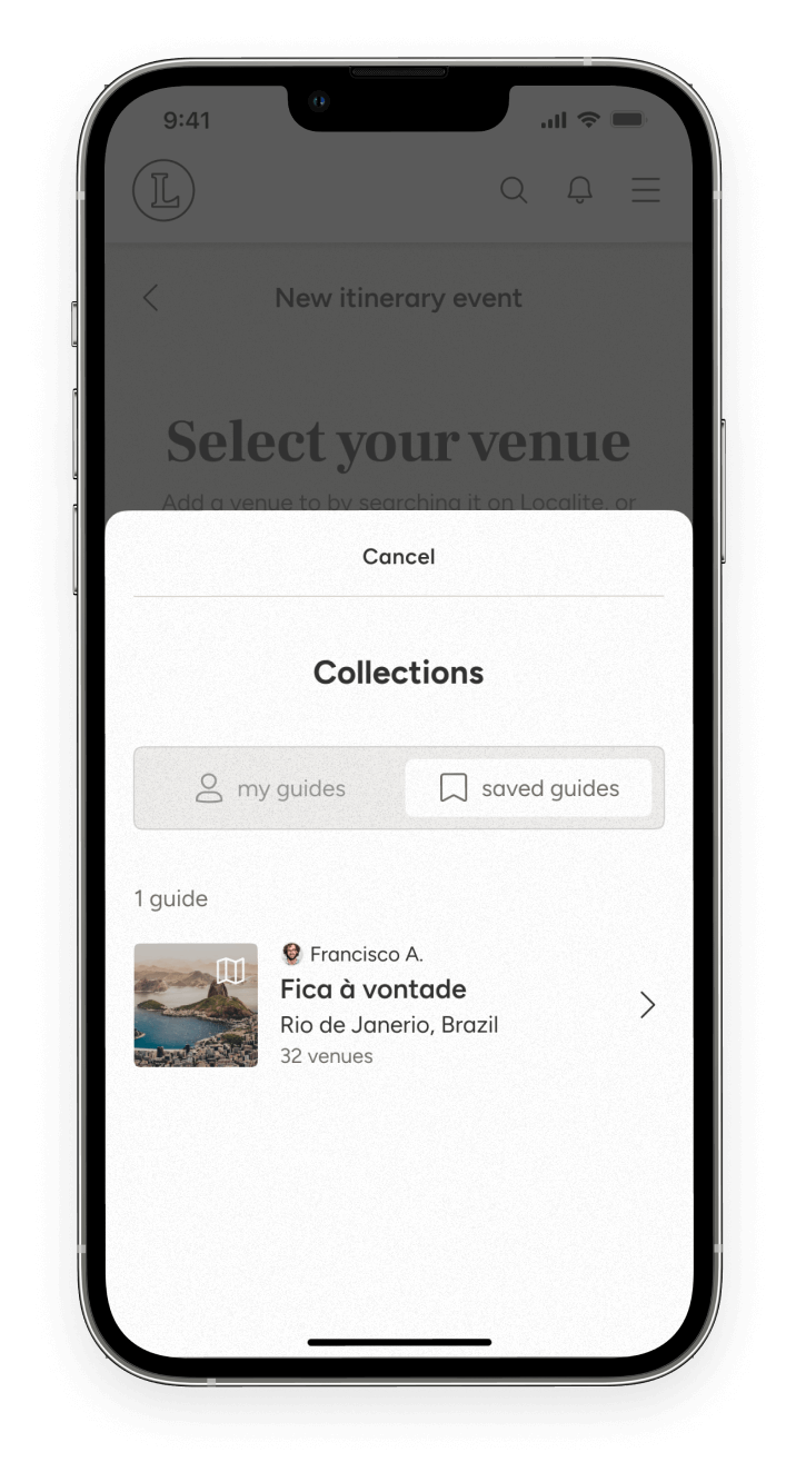
Key Features
- Post venue recommendations
- Save venues to a collection
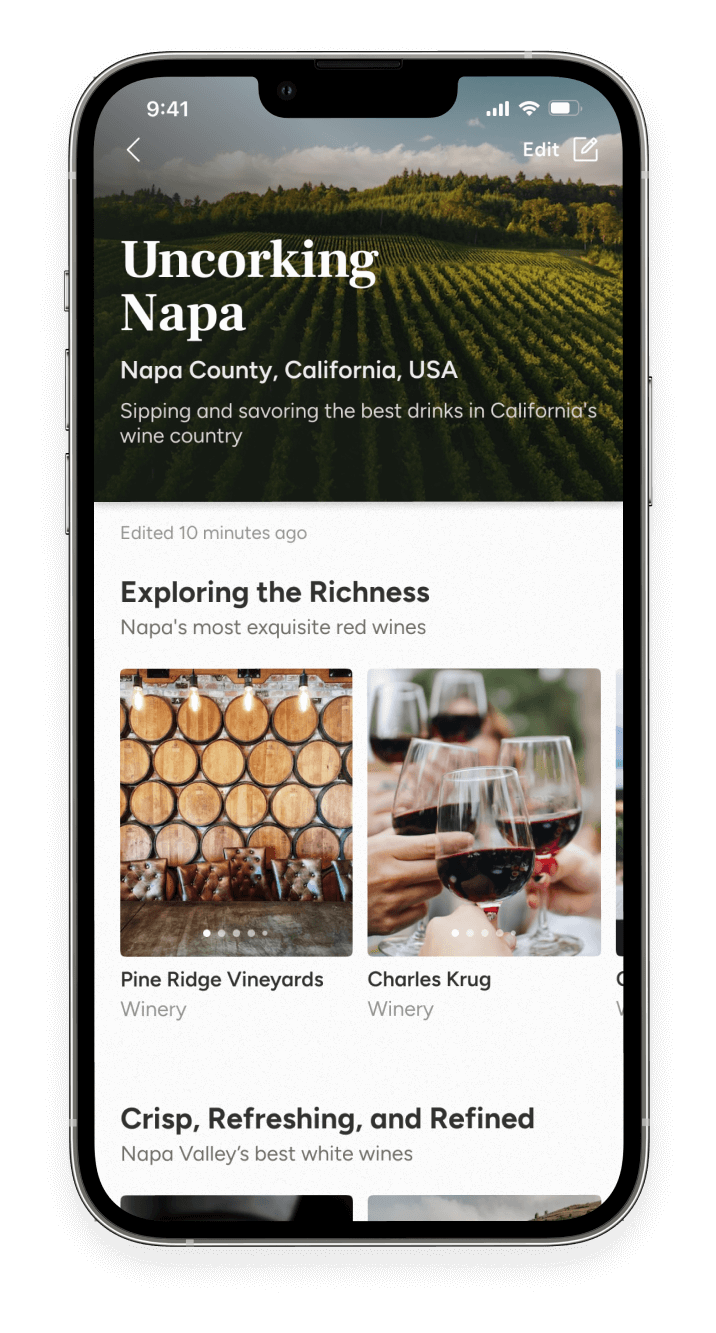
- Create and share location guides
- Share stories of restaurant and venue experiences
- Create collaborative itineraries with other users
Competitor Analysis

Competitor Overview
A popular platform connecting consumers with local businesses, particularly focusing on restaurant reservations and quotes, with a large user base and a presence in 32 countries.
SWOT Analysis
Strengths in benefiting businesses and consumers, weaknesses in global expansion and potential negative impact on local businesses, opportunities in social media development and technology/design improvements, and threats from competitors and potential lawsuits.
UX Analysis
Yelp can improve usability, navigation, and feedback while offering compatibility across devices, clear differentiation, and effective calls to action.

Competitor Overview
Foursquare aims to understand how people move through the real world, with a focus on providing advanced technology and human interaction for businesses and users through its Foursquare City Guide and Swarm apps.
SWOT Analysis
Strengths lie in its advanced location technology, global expansion, and social influence, while its weaknesses include shifts in focus and outdated reviews. There are opportunities for improving social media influences, UX/UI features, and collaborations, and threats come from competitors and social media platforms.
UX Analysis
Offers usability and a straightforward layout, but improvements are needed in navigation, compatibility, and the sign-up process to enhance the user experience.
User Interviews
To guide the process, user interviews were conducted with 3 participants to gain insight into restaurant and venue search experiences from real users.
Patterns
Preference for sharing and documenting venue experiences, valuing local opinions, and relying on visual aids and objective information for decision-making, while commonly using Google Maps and Instagram in their process.
Goals
A desire for updated images and videos that accurately showcase venue aspects, clear and objective information like price and hours, a save feature for future visits, and relevant filtered search results and suggestions.
Pain Points
Usability issues with other recommendation platforms like Yelp, the need to search multiple platforms for important venue information, and dissatisfaction with poor search result functionality and user interface.
Surprises
Interest in capturing and sharing venue experiences through images and videos, as well as documenting their memories. Additionally, one participant completely avoided an industry-standard platform due to frustrating usability.
Quotes
- “The order that results appear is important, focusing on straight to the point, current results that can be filtered from lots of different categories”
- “I use TikTok because you get a person narrating their experience and you see what the food looks like”
User Personas

Mira
Female, 28, Married, Project Manager
A busy urban homeowner who enjoys going out to reward herself after work and takes initiative in planning outings with friends.
End Goals
- Find and support local businesses in her community.
- Discover venue suggestions that are transparent about the location, price, ambiance, and product.
- Avoid recommendations that come with any distracting, negative surprises.

Sydney
Female, 21, Relationship, Student
A recent graduate who likes “no frills” venues, is taking a road trip from South Carolina to Washington State where she will attend grad school.
End Goals
- Discover authentic places to eat and drink while on her road trip journey.
- Avoid any “tourist trap” recommendations.
- Utilize app features when planning her trip, on the go, and when no internet service is available.

Daniel
Male, 32, Single, Software Engineer
A bachelor in the LGBTQ+ community worker who frequents staying at short-term rentals due to his desire to travel and explore different cultures.
End Goals
- Find reliable LGBTQ+ friendly venues during his travels.
- obtain recommendations from locals for everyday cafes and work-friendly spaces
- Access specific search criteria to get accurate and relevant results.
MVP and Jobs to be Done Framework
This approach allowed me to better understand the needs and goals of the user so I could include corresponding features and functionalities to improve user experience.
MVP Objective
Gain validation from target users that such an app will be used to review and recommend local venues, discover new venues, save and organize their findings, share their experiences, and be trusted by its users.
- When finding a restaurant to visit, Mira wants to know how expensive it is and see pictures of the food and interior, so she can assess if the quality is worth the price.
- When going out, Sydney wants to document his experiences, so she can look back at all the fun she had with her friends or the yummy meals she ate.
- As a frequent traveler staying at long-term rentals, Daniel wants to know where the locals are going, so he can meet new people at a trusted location.
- As a homeowner, Mira wants to know the local-owned businesses, so she can support her community.
- When visiting a new city, Sydney wants to save the cool venues she visited, so she can remember them for future reference.
- As an individual in the LGBTQ+ community, Daniel wants to know what bars are LGBTQ+ focused and recommended by other gay individuals, so that he can comfortably socialize.
- When planning a trip with others, Mira wants to organize venues to visit, so she can make an itinerary and share it with her friends.
Formulating Tasks
From user interviews, personas, and MVP/JTBD framework, tasks were created to address user needs.
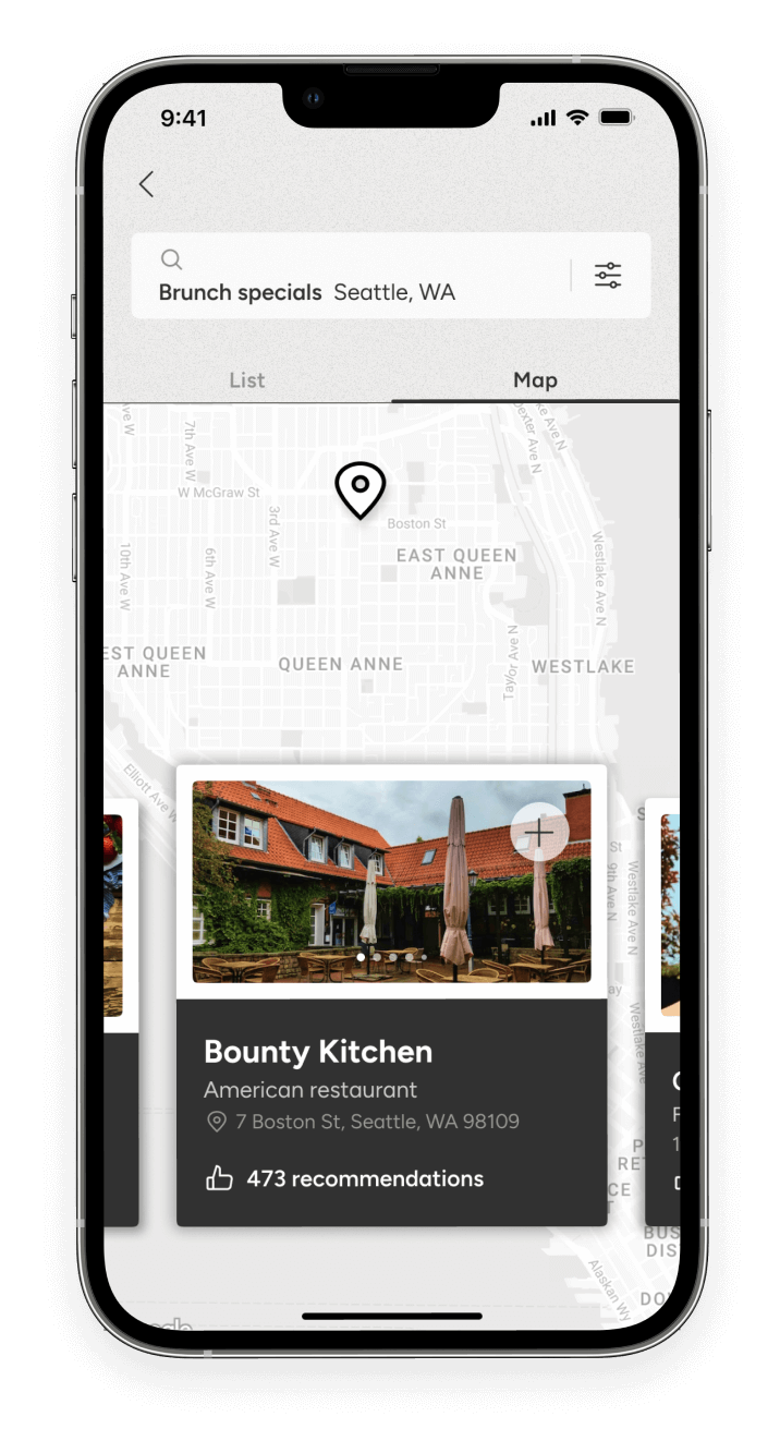
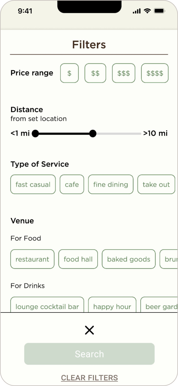
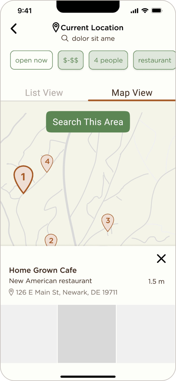
- Perform an advanced filtered search when browsing for venues.
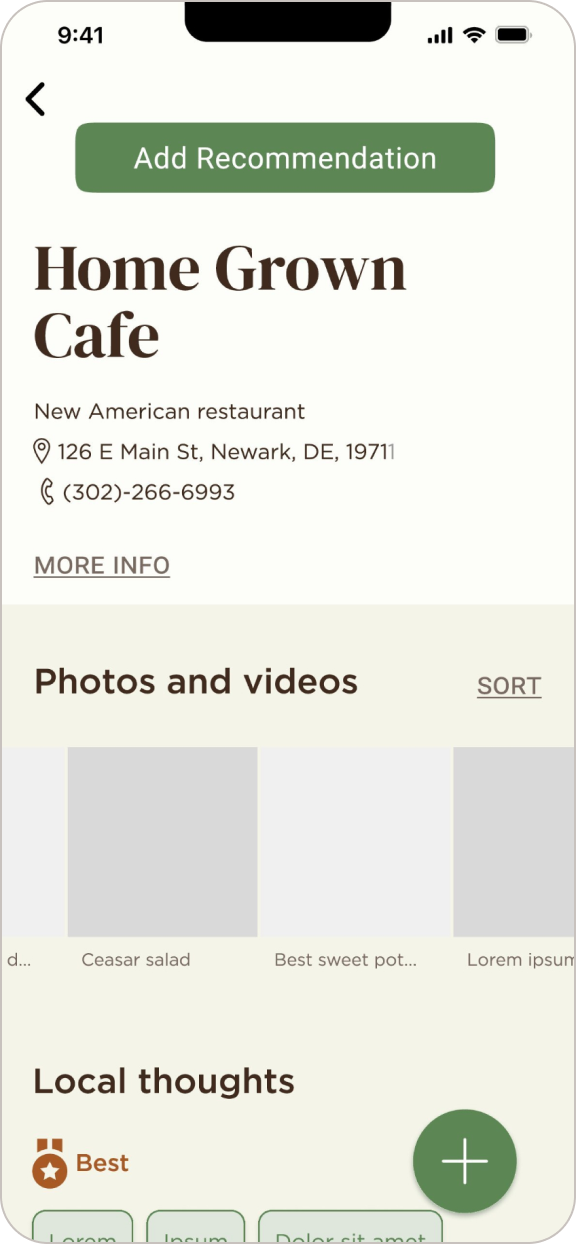
- Access restaurant and venue recommendations from local users.
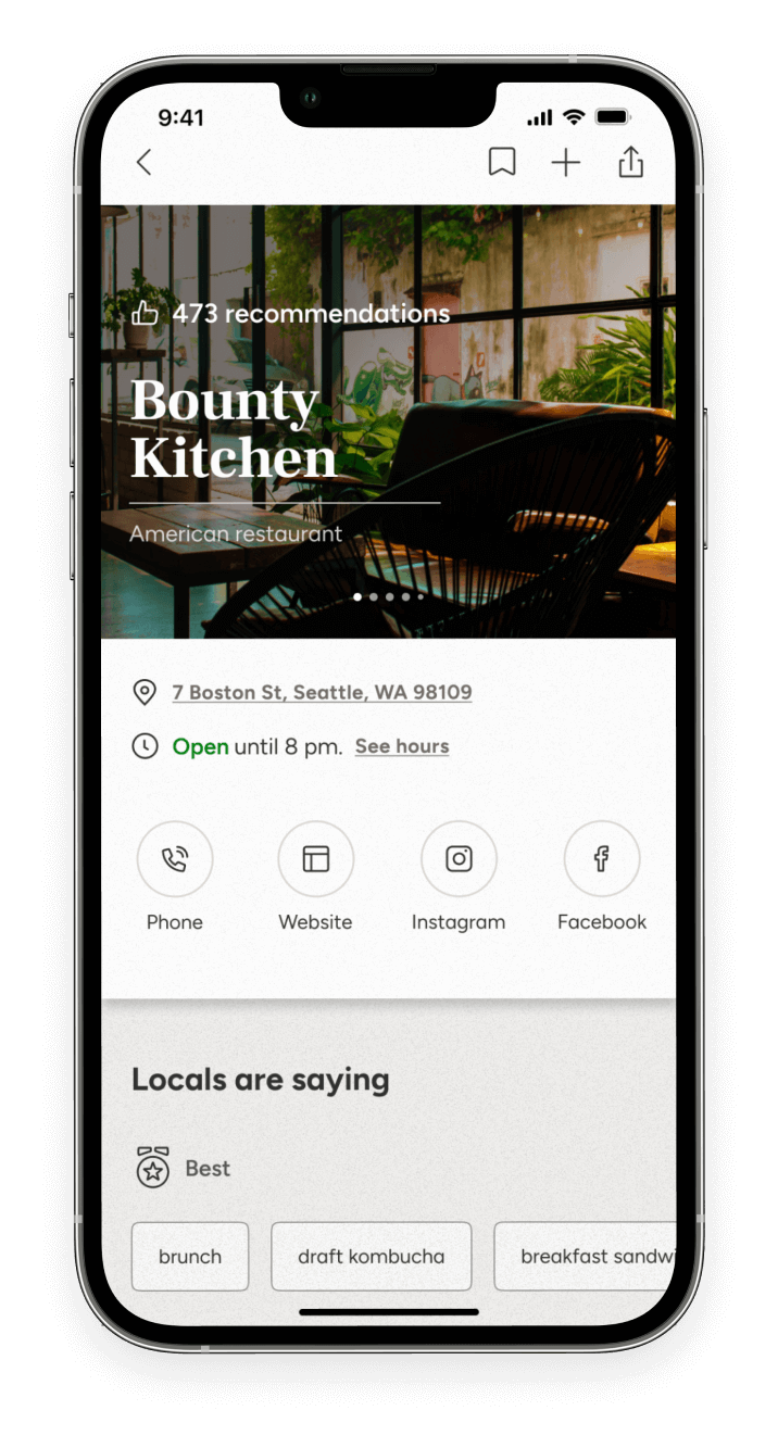
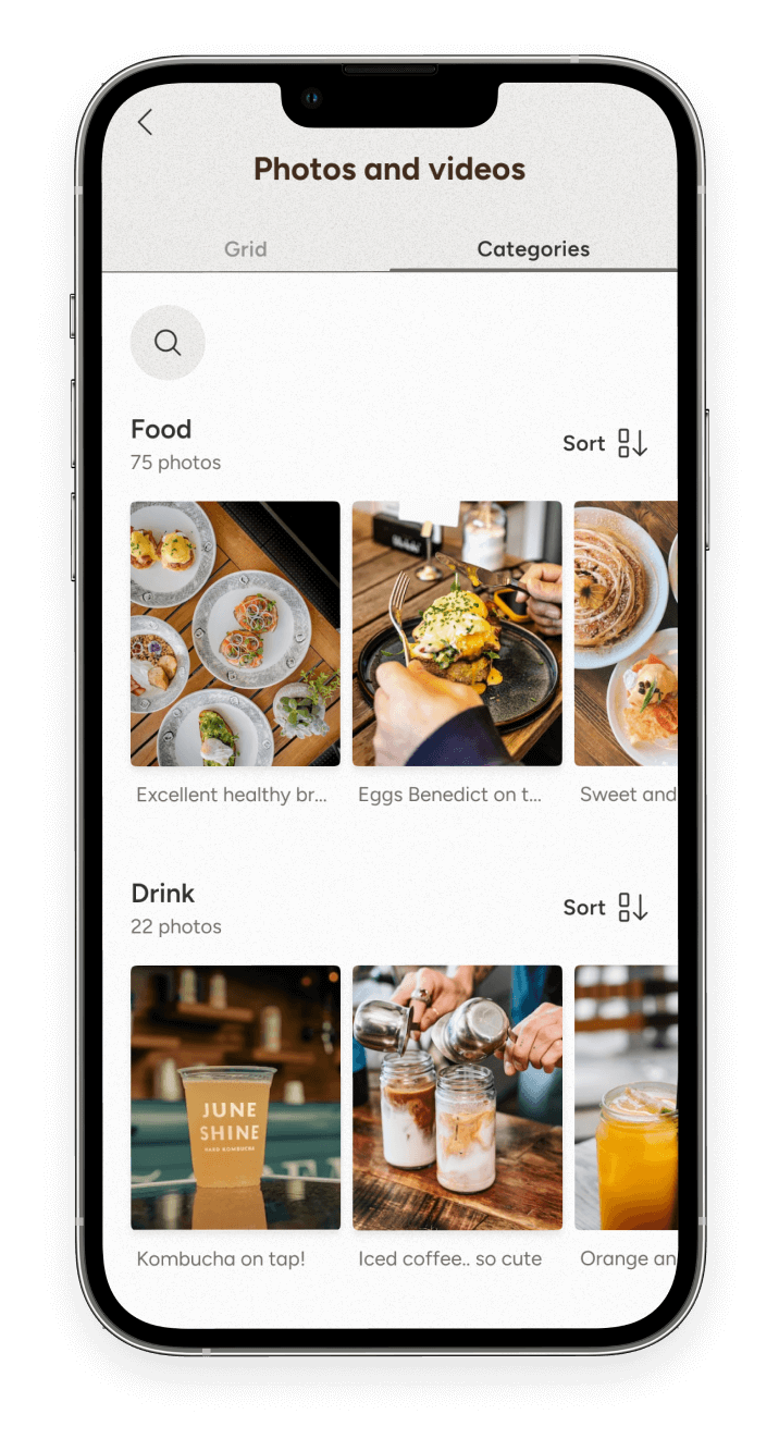
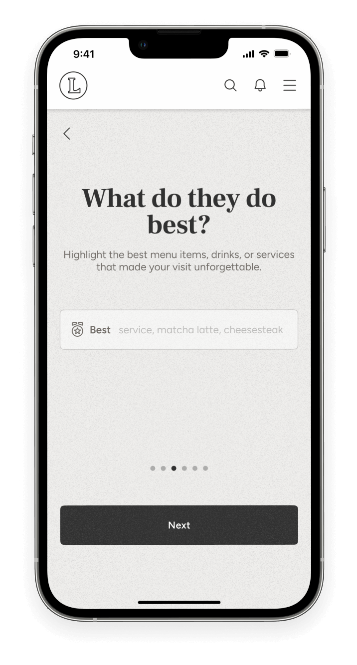
- Access photo reviews of a restaurant or venue.
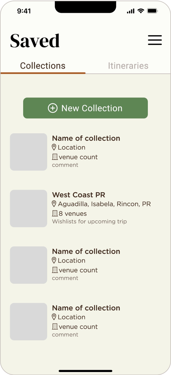
- Save restaurants and venues to a collection.
- Create a guide of favorite restaurants and venues for a certain location.
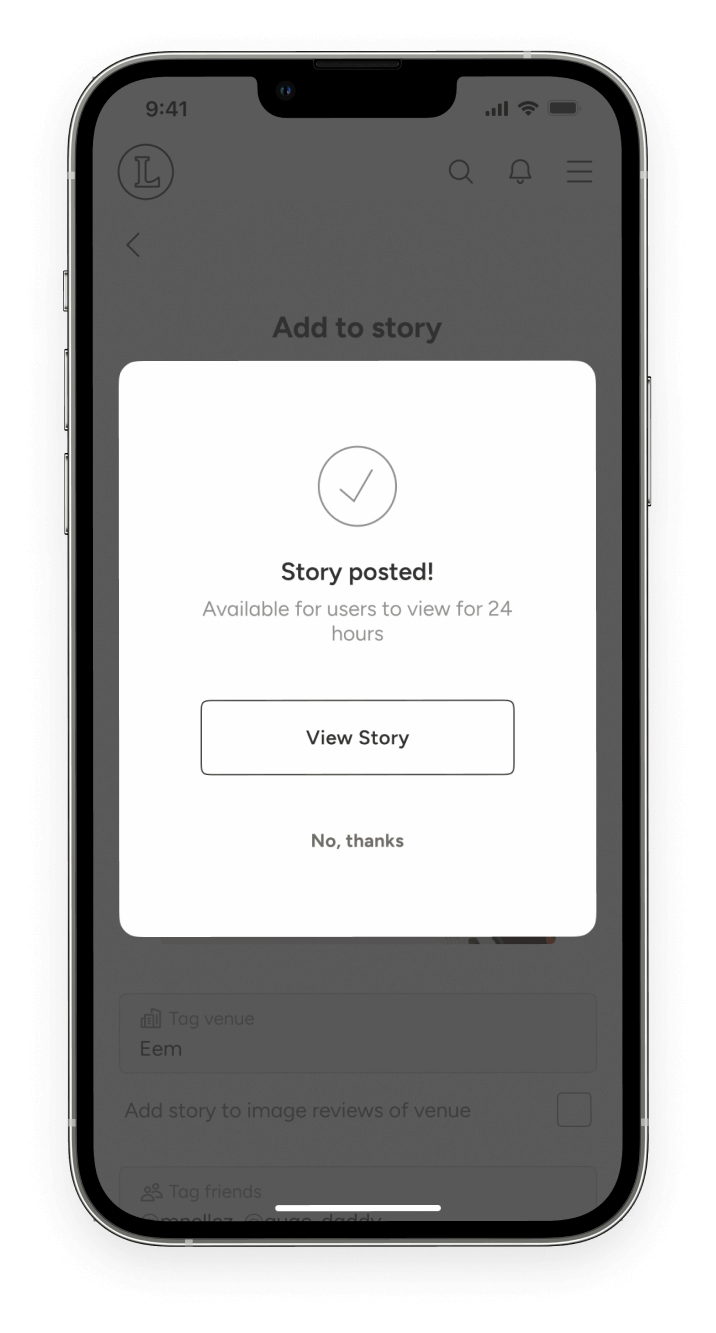
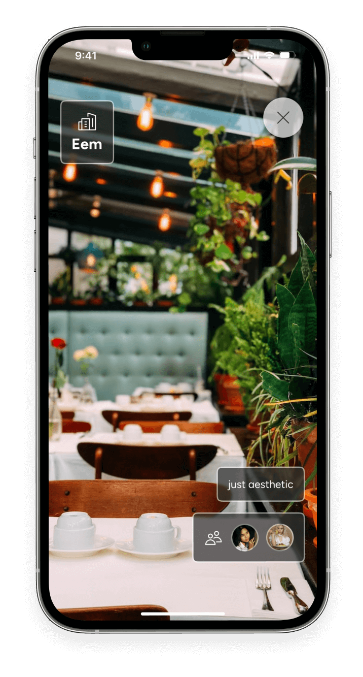
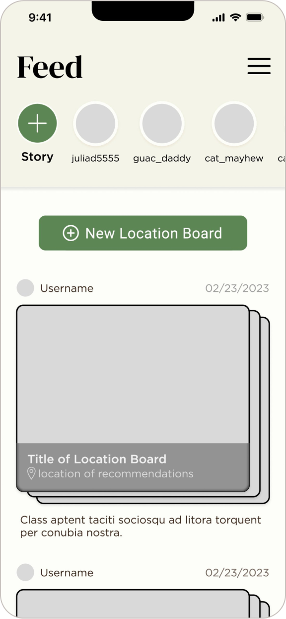
- Share real-time stories with other connected users when having a restaurant or venue experience.
- Create a collaborative itinerary with other users with restaurants and venues on the app.
User Flow
Comprehensive Flow
- Signing in
- Onboarding
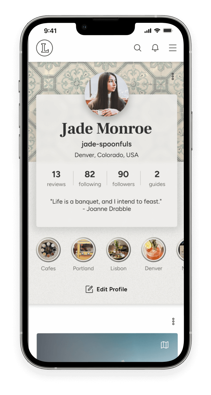
- Creating a profile
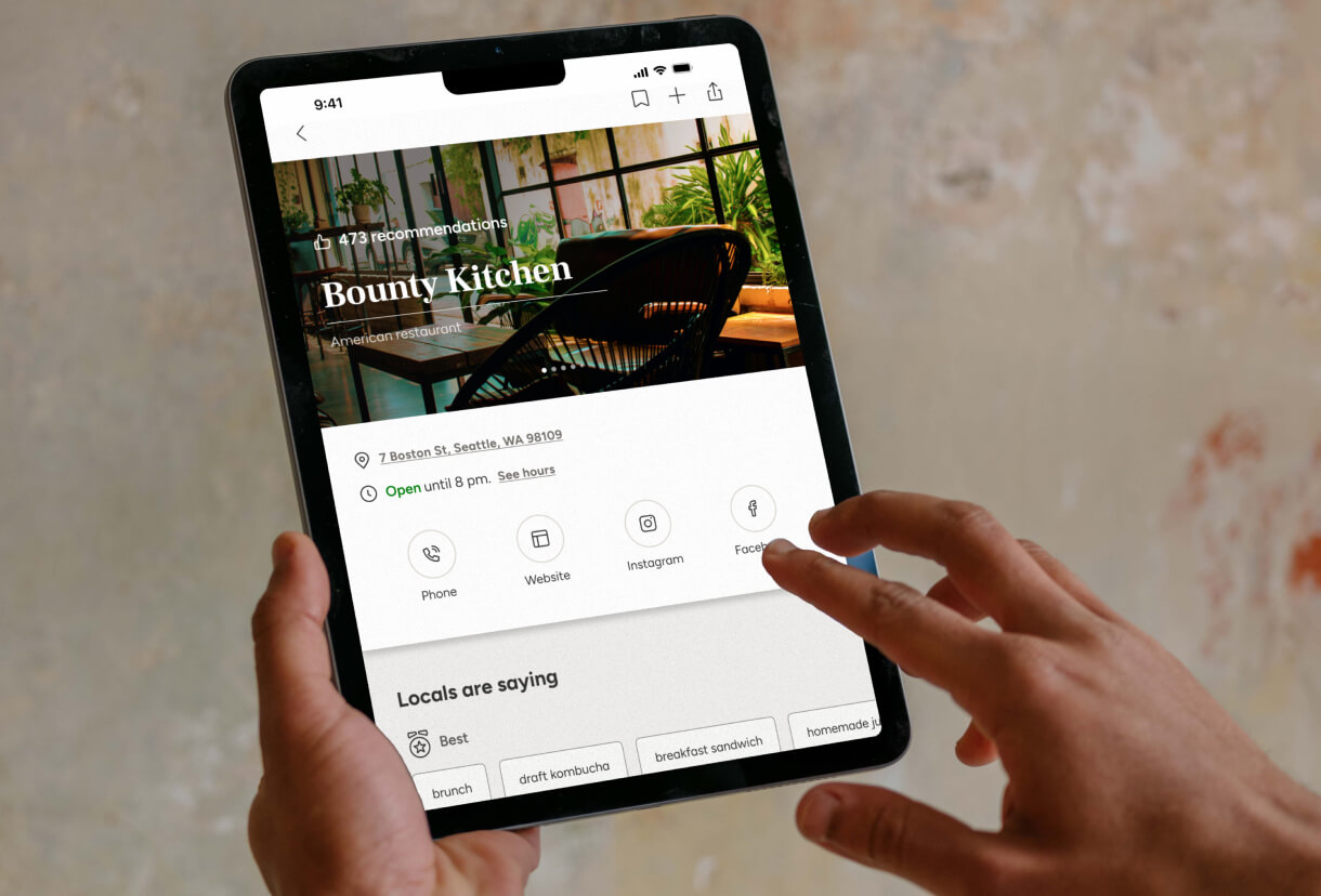
- Restaurant and venue exploration with filtered search
- Saving a venue to a folder
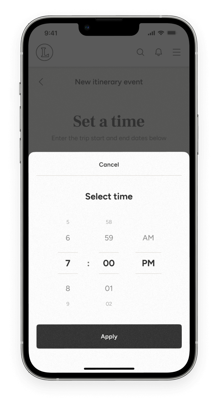
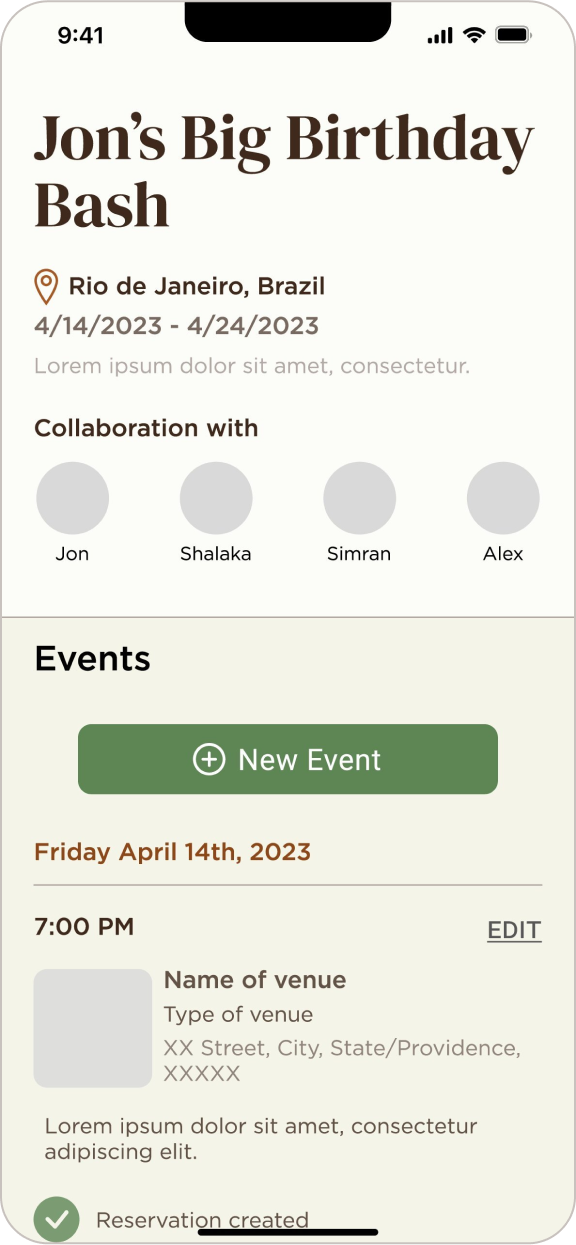
- Creating a collaborative itinerary
- Sharing a story at a venue
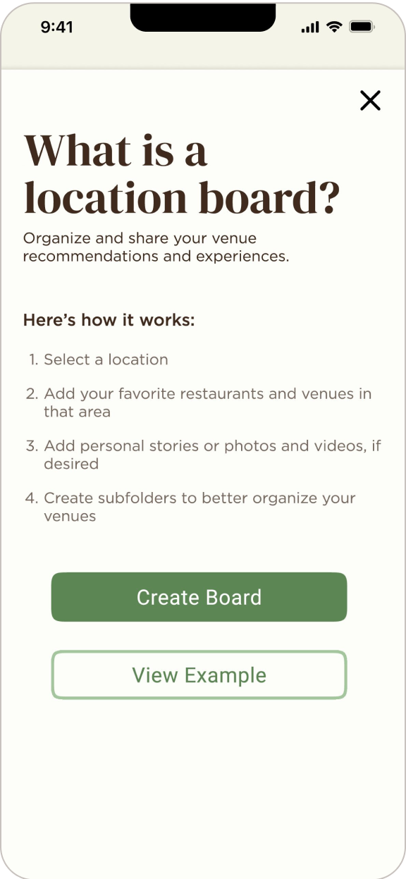
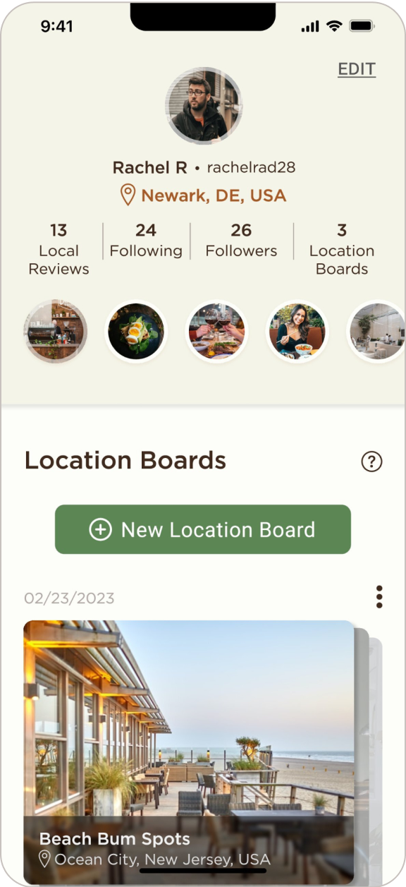
- Creating a location-board
Low Fidelity Wireframes
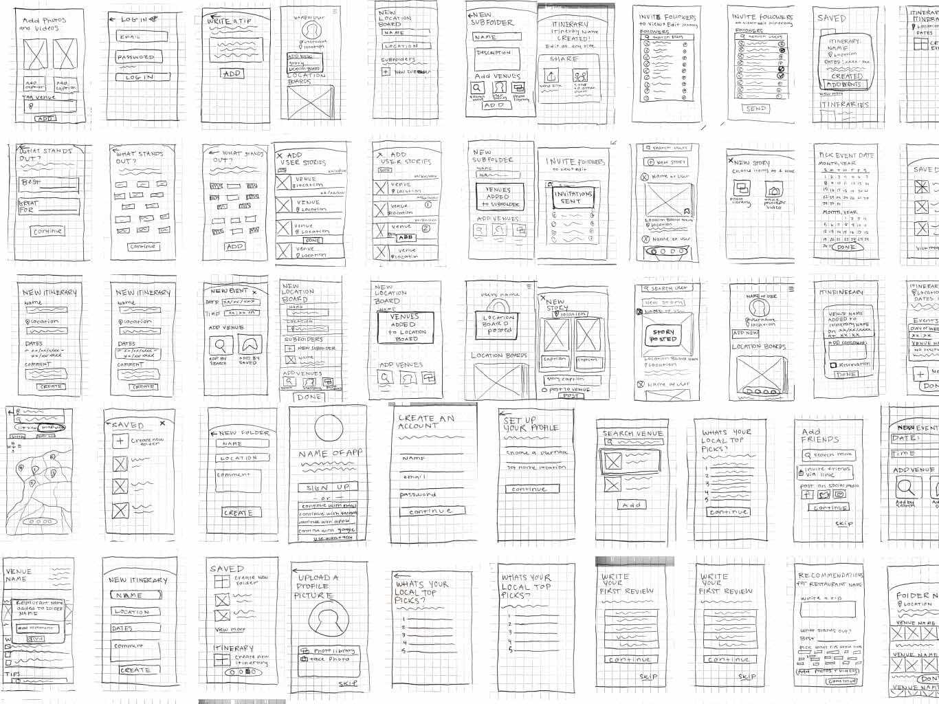
Usability Testing: Paper Prototype
Aimed to evaluate the usability of the prototype, with a focus on the assessment of navigation, flow, and features. Moderated and recorded tests were conducted either in-person or remotely via screen-sharing. Three participants completed five assigned tasks within the prototype. Throughout the session, participants were encouraged to share their feedback, report any encountered problems, and provide suggestions for improvement.
Tasks
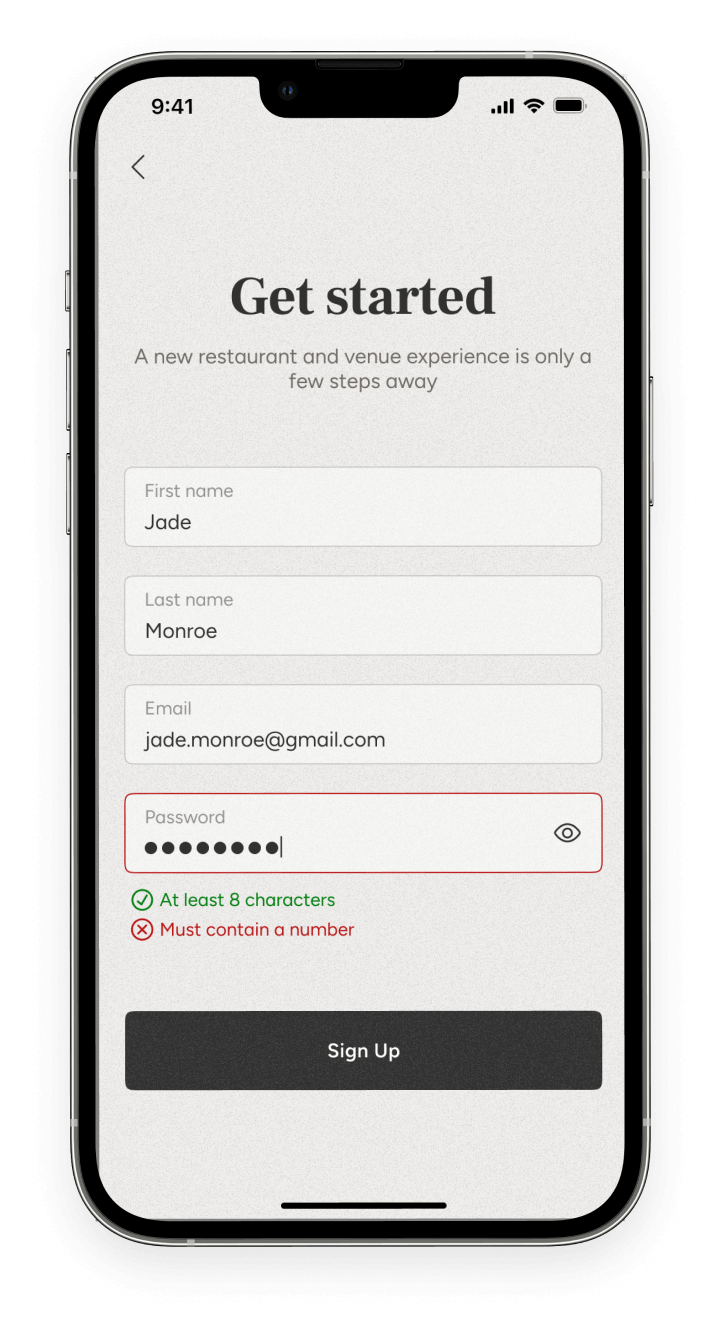
- Sign up
- Save a venue
- Post a story
- Create an itinerary
- Post a location board
Highlights
- Users appreciated the skip button during orientation phases and the option to share the app with friends via a link instead of adding them from social media.
- The filtered search feature for saving venues was well-received, and users found it easy to navigate and complete the task.
- Users were able to post stories with ease once they found the button, and they quickly understood the flow on the feed screen.
Challenges
- Users faced difficulty in navigating the screens to find where to post a story, as the prototype lacked visual differentiation. The layout was also harder to follow due to the limited clarity of the sketches.
- Some users were unsure of which screen the created itineraries would post to, and they suggested having a dedicated itinerary page for better clarity.
- There were navigation challenges in finding where to create a new location board, and users were confused about the arrangement of buttons for stories and location boards.
Feature Suggestions
- Clearer titles and explanations were suggested for certain screens, such as "Top Local Picks" and onboarding screens, to improve understanding and direction.
- Decreasing the number of favorite local venues to input and considering alternative terms like "list" instead of "folder" were suggested for better user comprehension.
- Users recommended adding descriptions or explanations for certain features, such as the floating tab bar and the purpose of location boards, to aid navigation and understanding.
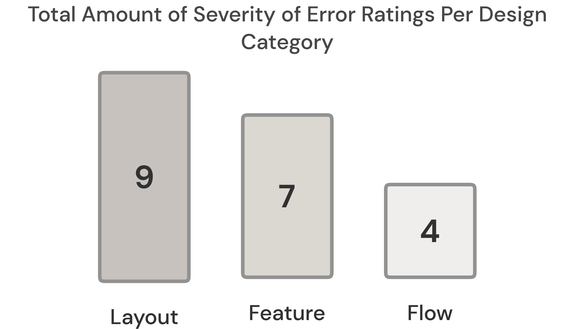
Severity Ratings
- No usability problem
- Cosmetic problem only
- Minor usability problem
- Major usability problem
- Usability catastrophe
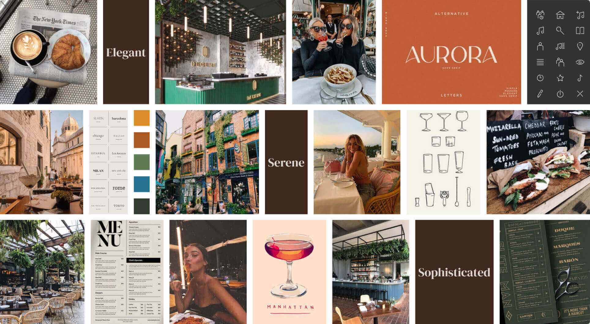
Moodboard
A/B Preference Testing
This A/B testing had 31 respondents who compared two differently designed landing pages. This enabled me to gather user insights and determine the preferred design that would enhance user engagement.
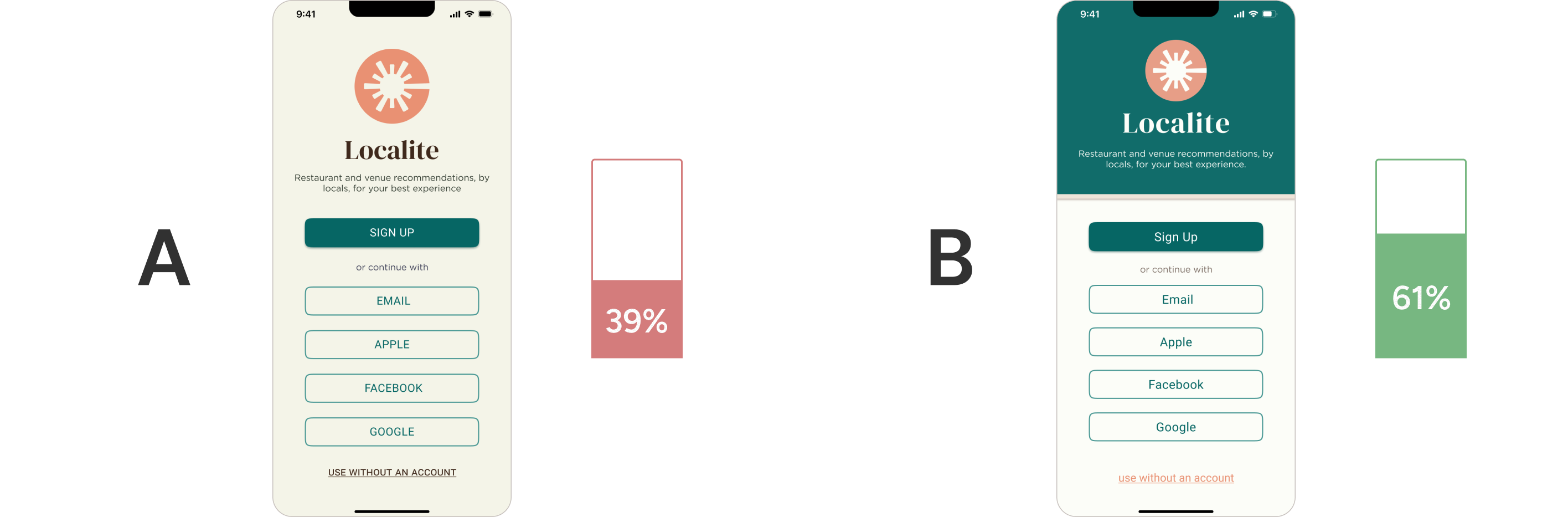
Participants that Preferred 'A'
- “more eye-popping”
- “I like the green portion, the other was too much of one color and kind of hurt my eyes”
- “calmer”
- “more contrast in the color”
- “drew my eyes and made me want to see more”
- “more visually interesting”
Participants that Preferred 'B'
- “bright, interesting, and more inviting”
- “I liked the contrast of the green buttons rather than the green divide of the other option”
- “I like these colors better together”
- “more aesthetically pleasing”
- “nice outline and looks professional”
- “I like that the Sign-Up button was in all caps”
The test results indicated B was statistically significant, with a 90% confidence level, suggesting that the observed difference is not due to random chance.
Mid-Fidelity Wireframes
Style Guide
Colors

Buttons

Input Fields

Check Box

Icons

Imagery

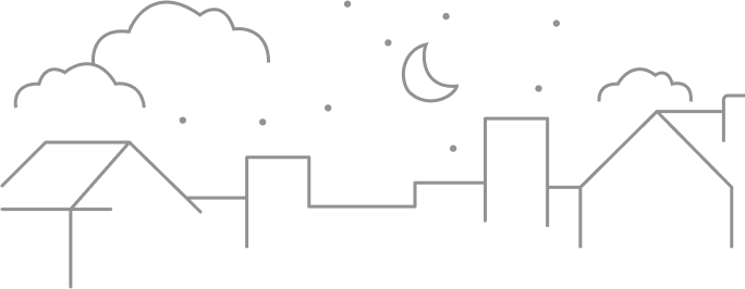
Illustrations
Copy Language
- Upbeat
- Exciting
- Encouraging
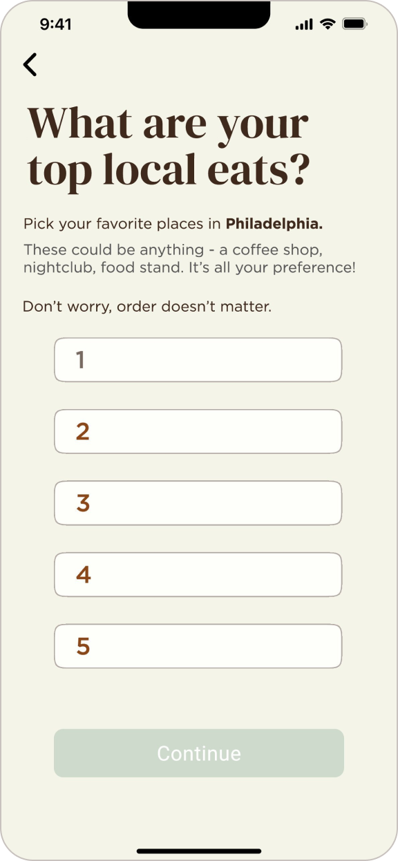
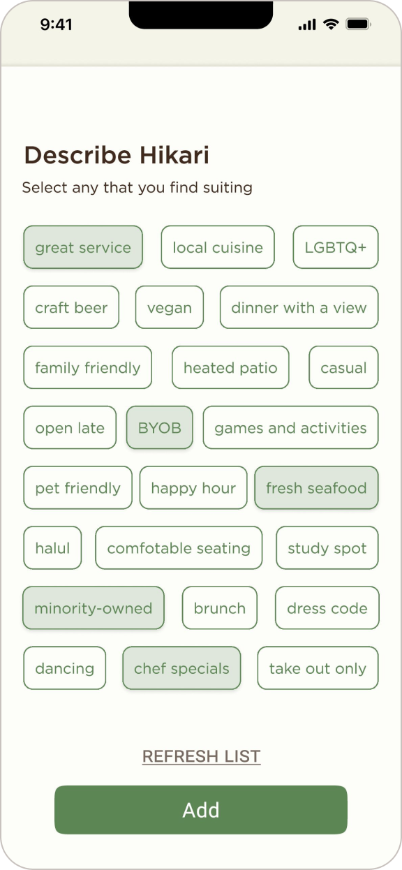
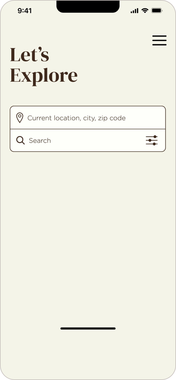
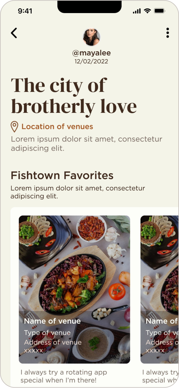
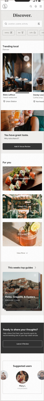
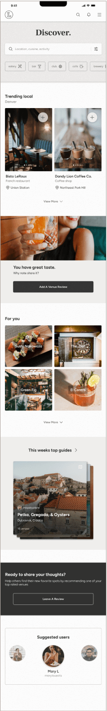
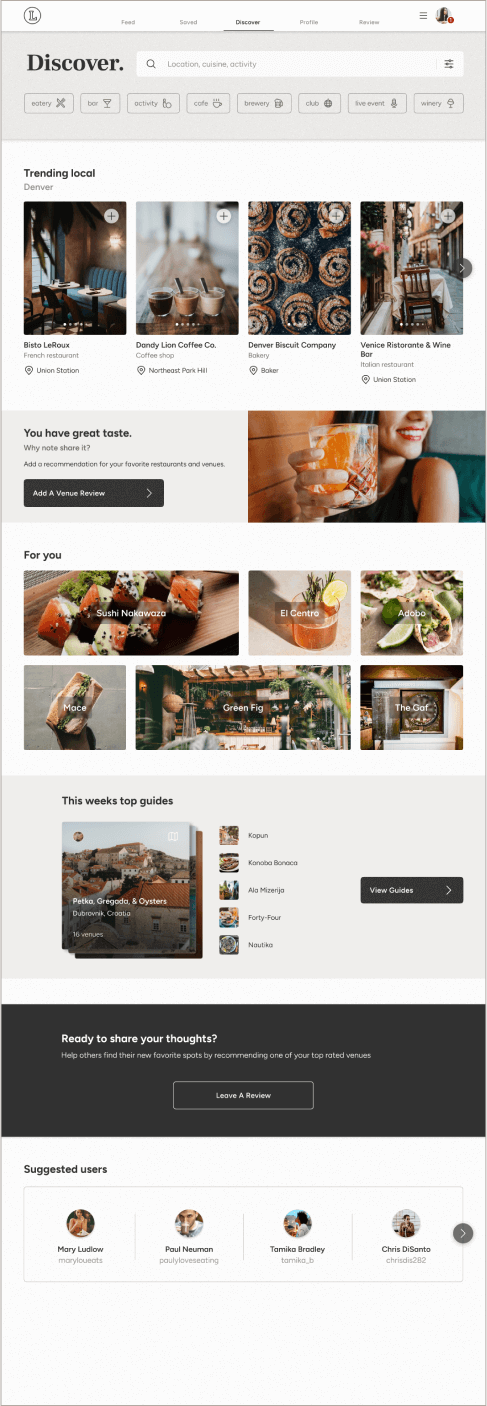
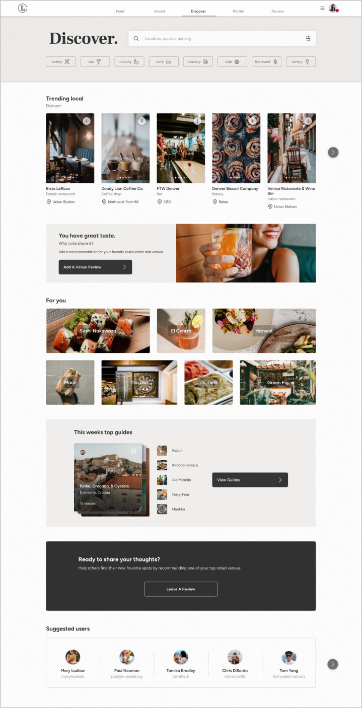
High-Fidelity Responsive Wireframes
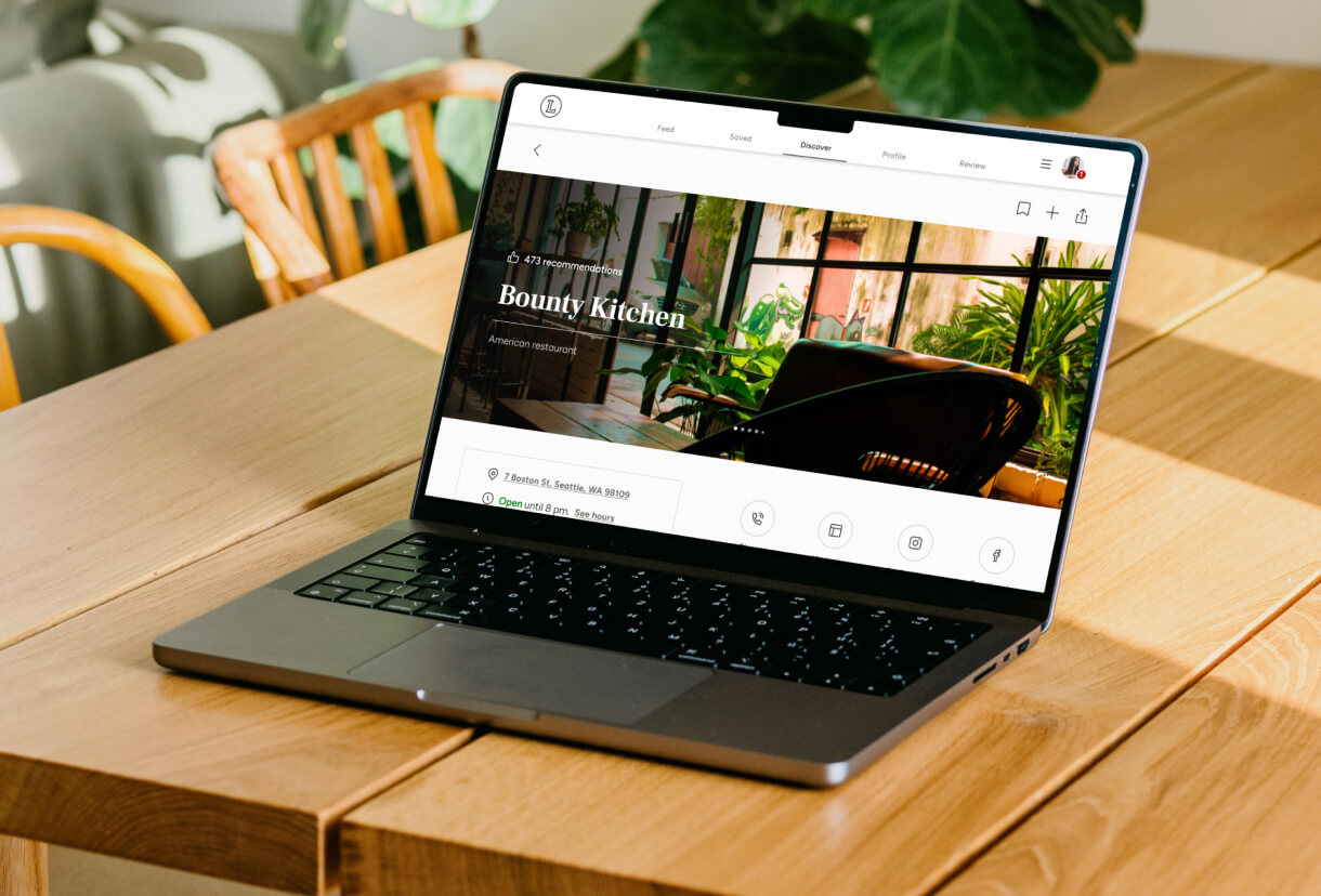
Mobile wireframes adapted to become responsive for small, medium, and large breakpoints to accommodate tablets, laptops, desktops, and other devices. This was implemented by using a stretch grid system.
Final Designs