Via Euroasia Redesign
In this redesign project, I revitalized the user interface of the NGO Culture Routes Society's app to enhance user experience and address navigation and design challenges.
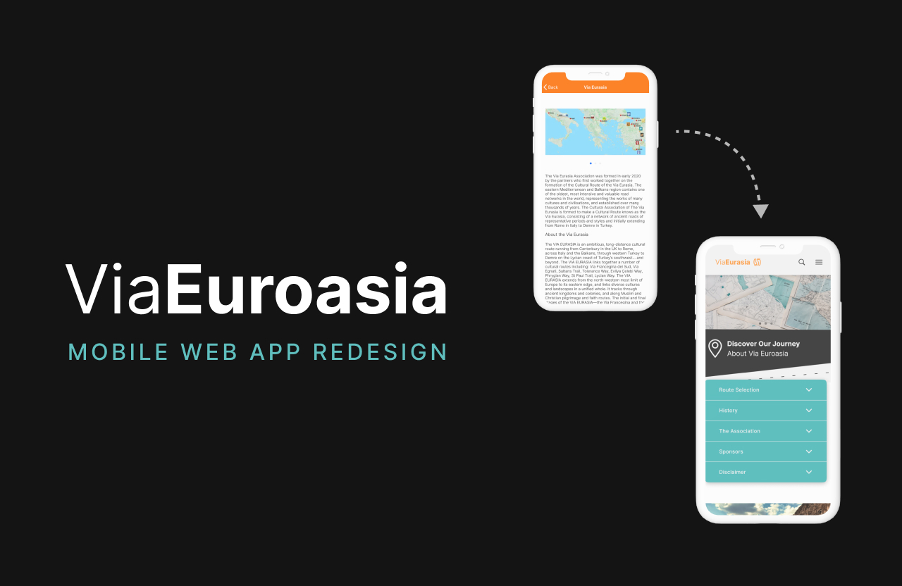
Table of Contents
My Process
Project Overview
Specs
Role
UI designerDuration
48 hoursTools
Figma
Context
As part of a fast-paced project, I undertook the redesign of the NGO Culture Routes Society's app, Via Eurasia. The initiative was fueled by a recent acquisition that injected additional funds into the project. To kickstart this revitalization, a copywriter was brought on board to refine app copy, and my role was to leverage user feedback to drive the new design.
Problem
User feedback shed light on several pressing issues within the existing app. Users reported confusion in navigating the interface, an excessive number of screens, and an overall outdated branding aesthetic. These challenges collectively contributed to diminishing user engagement and posed accessibility concerns. The project also benefitted from insightful feedback from the Creative Director at Culture Routes Society.
Objective
Create a seamless, intuitive, and visually pleasing user experience by enhancing navigation and elevation of the visual appeal of the app while adhering to accessibility guidelines.
Solution
Create a comprehensive redesign of the Via Eurasia app to systematically tackle the identified challenges. Key components of this solution included simplifying navigation pathways, reducing screen redundancy, modernizing branding, ensuring accessibility compliance, and integrating user feedback and the Creative Director's recommendations into the design.
Design Requirements
- Improve navigation within the app
- Reduce the number of screens while maintaining essential content
- Modernize branding and color schemes
- Ensure compliance with accessibility guidelines
- Collaborate with a copywriter to refine app copy
- Implement user feedback and adhere to the Creative Director's recommendations
- Transform the "Home" page into a visually appealing "Welcome" page by relocating sponsor logos and legal text to the "About" page
- Replace the "Check Before You Go" page with an intuitive menu featuring "Route Updates" "Weather," and "Guide Book" sections
- Design a new logo
- Keep existing Inter typeface
- Optimize text size and weight for improved hierarchy and accessibility
Style Guide Updates
Meticulous updates were made to the color palette, logo design, and essential UI components. Through these enhancements, the app's overall user experience was not only elevated but also aligned with modern design trends and accessibility standards.
Colors
Before

After

Logo
Before
After

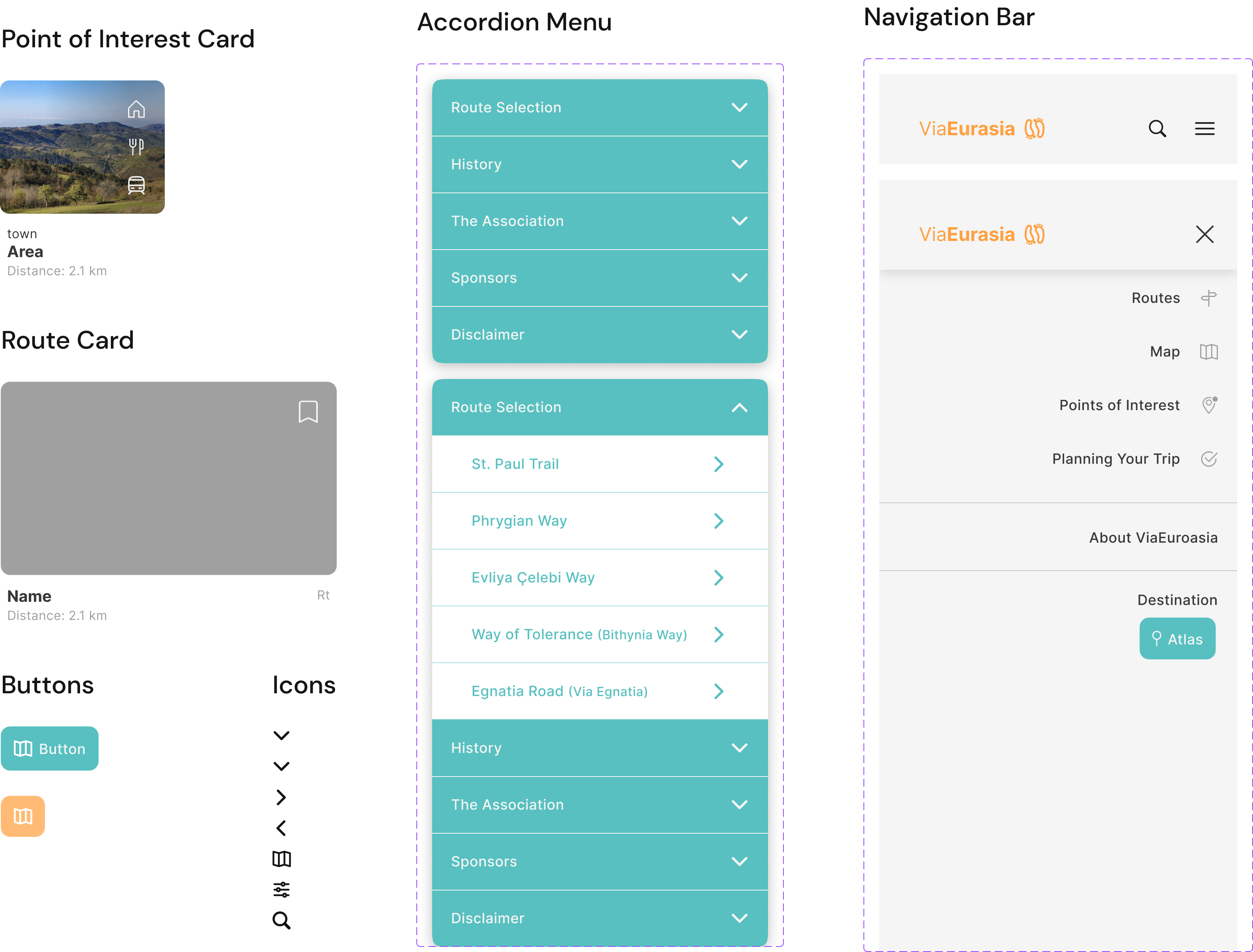
Components
Before
After
Before and After Designs
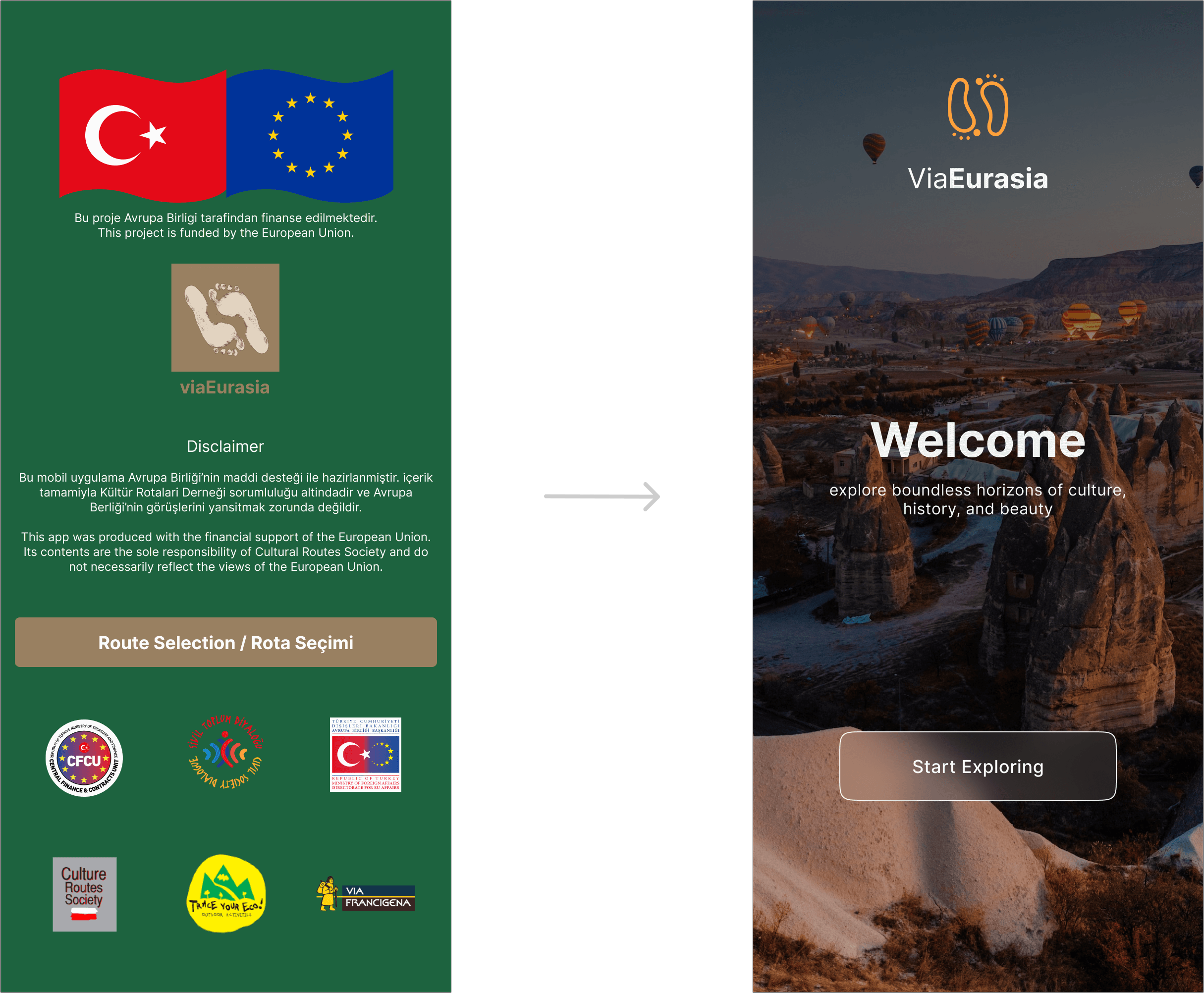
Welcome Page
Annotations
- Updated to look more modern and welcoming
- Per the art director, legal copy and sponsors moved to about page
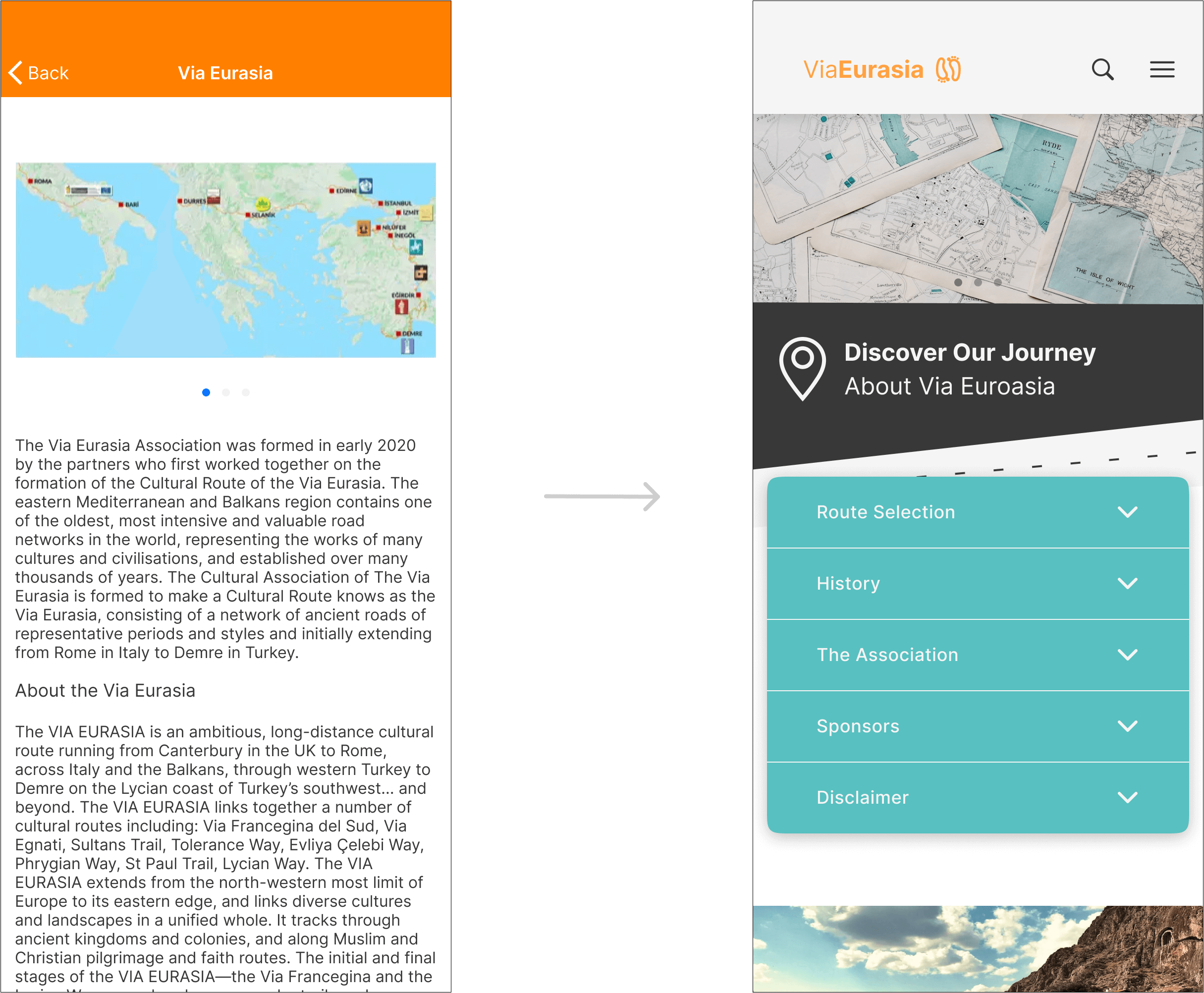
About Page
Annotations
- Updated image due to poor quality of original map image.
- Although this map image does not support current information, until there is an updated image, this photograph will serve as a placeholder
- Per the Creative Director, the About screen should be reorganized for visual appeal
- Addition of more vibrant images and simple graphics to increase engagement
- Per the Art Director, legal and sponsor information is added to this screen
- Due to the high amount of content that was assigned to this screen, a menu was added to allow for easier navigation of the information
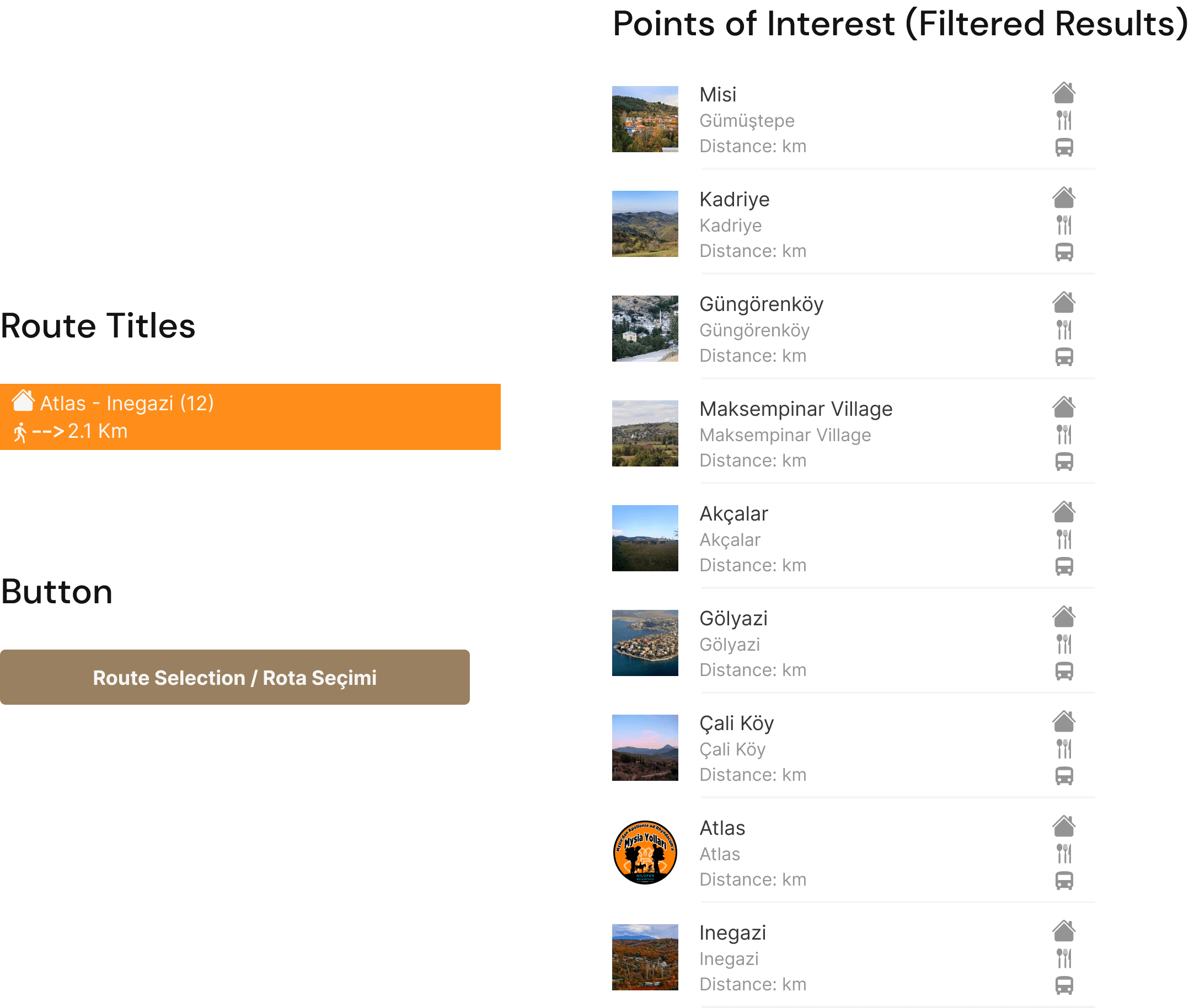
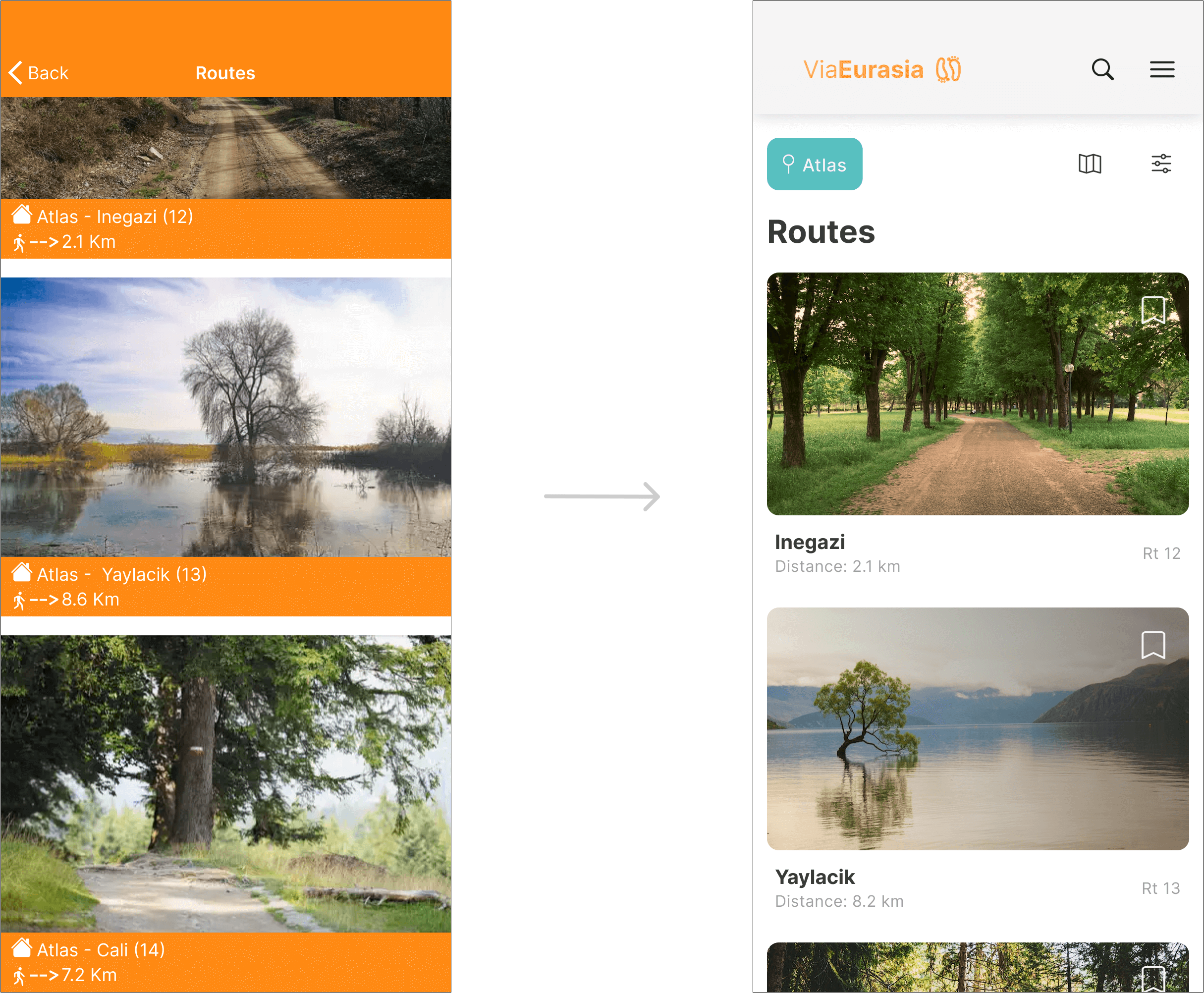
Route Page
Annotations
- New logo with updated typography to support a more modern design
- Logo monochromatic to support various backgrounds
- The previous formatting of the cards was confusing, the addition of a location button at the top was included to decrease clutter in the card
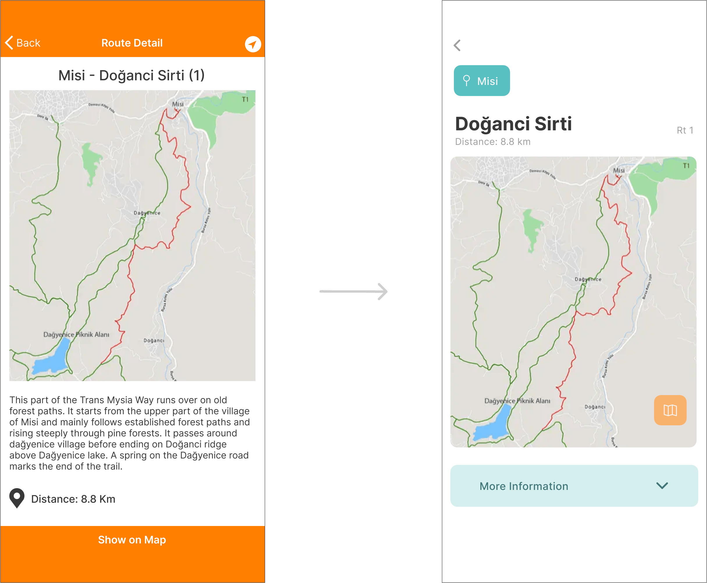
Route Detail Page
Annotations
- Removal of the top nav bar when not on a main screen
- Rounded corners were added to the map container to adhere to the styling of images and buttons
- The orange map button replaces “Show on Map”
- The description was very lengthy on the original design. Drop down menu added to save space, giving the user the option of reading more information about the route
Points of Interest Page
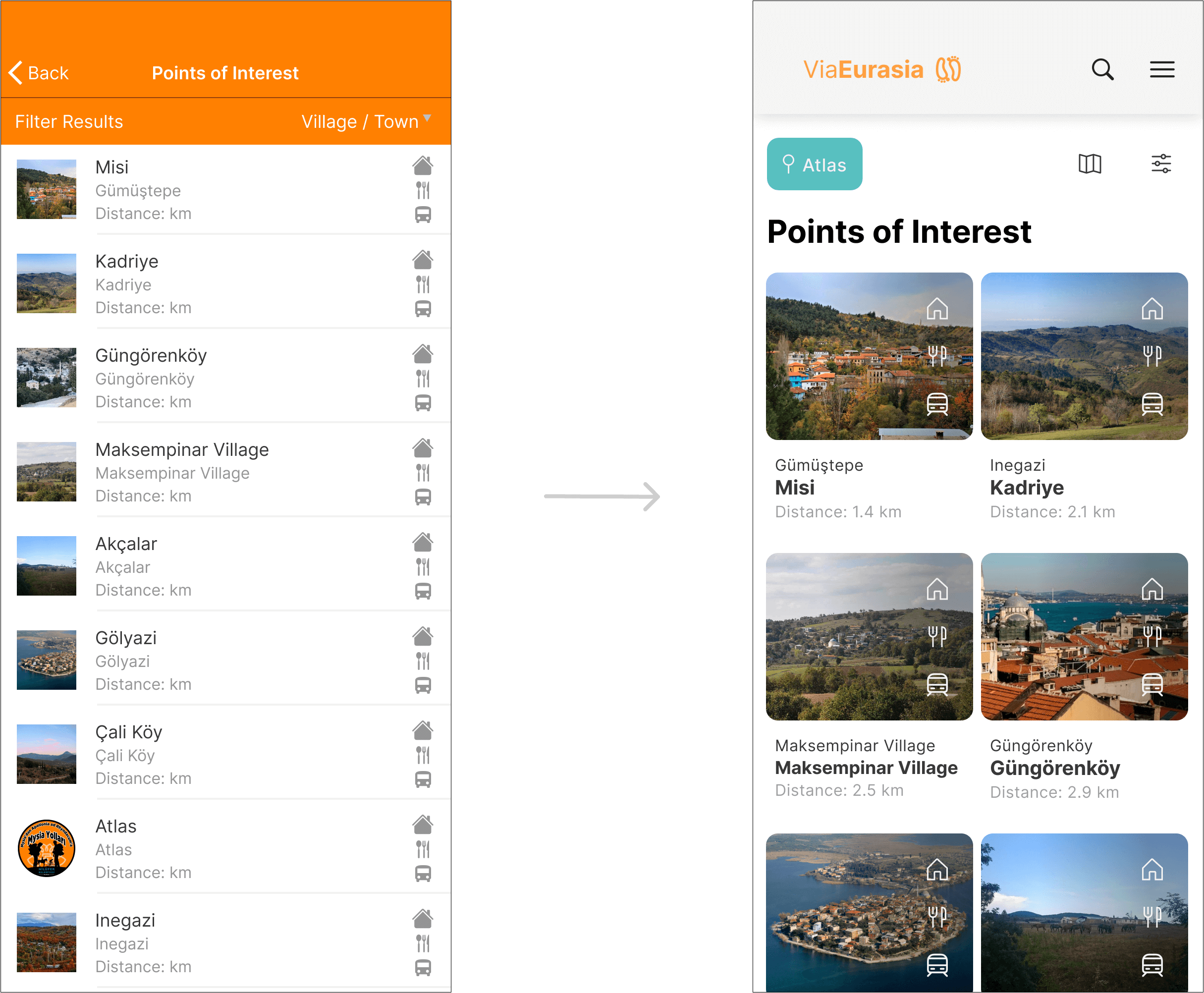
Annotations
- Addition of button icons to display function while keeping the screen minimalistic
- Icons updated to support outline styling used in previous screens
- Increased padding between icons to make them more effortlessly tappable
'Check Before You Go' Page
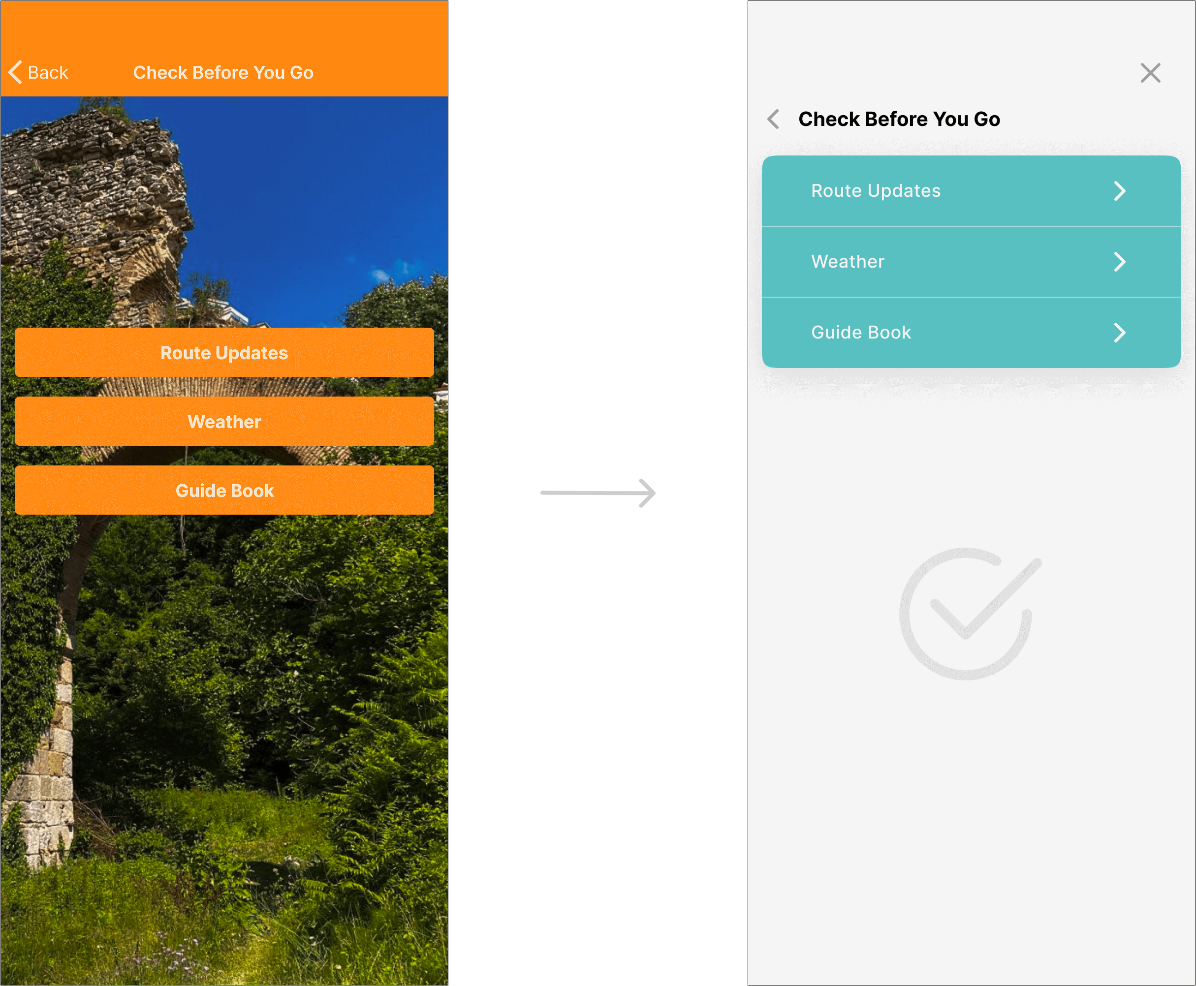
Annotations
- Per the Art Director, the “Check Before You Go” screen became a menu
- Updated colors to reinforce color scheme and establish a hierarchy