Portfolio Website
In this case study, I showcase my work on coding a personal portfolio website from scratch. The project revolves around the need for a dedicated online platform to showcase my UI/UX designs, enhance professional credibility, facilitate networking, and highlight my recently acquired front-end development skills as a UI/UX designer.
My Process
Project Overview
Role
- Front-end Developer
- UI Designer
- UX Designer
Duration
- 6 weeks
- Start: June 2023
- End: July 2023
Language
- HTML
- CSS
- Javascript
Tools
- VS Code
- Github
- Figma
Problem
As a UI/UX designer, the absence of a personal portfolio website posed a significant challenge. Without a dedicated online presence, it is difficult to showcase my design projects, convey my skills effectively, and establish a professional brand.
Objective
Create a personalized website from scratch tailored specifically to my needs.
Solution
Leverage my UI/UX expertise to craft a visually appealing design that aligns with my brand and implement front-end development skills through the utilization of HTML, CSS, and JavaScript to transform the design into a fully functional website with intuitive navigation, seamless user interactions, and responsive layouts to ensure an optimal viewing experience across devices.
Goals
Through a curated selection of impactful design projects, I aim to showcase my expertise in responsive design, interaction design, visual design, prototyping, and information architecture. Each project should reflect a comprehensive design process, starting with user research, iterating on designs based on feedback, and delivering measurable positive impacts on user experiences or conversions. By presenting tangible evidence of my technical skills and ability to create engaging experiences, I aim to demonstrate my proficiency and value as a UI/UX designer.
Audience
My portfolio website targets two primary user groups: my professional network and potential employers. These users are individuals who are interested in exploring my professional work and potentially seeking collaboration opportunities or job prospects. By catering to the needs of these users, I aim to create a platform that effectively showcases my skills and experience while providing a seamless means of communication.
User Goals
- Users expect an easy-to-navigate website that allows them to find information effortlessly.
- Users desire a visually appealing website that engages them and showcases the designer's aesthetics effectively.
- Users aim to access my design projects and obtain valuable information about the designer's process, methodologies, and problem-solving approaches.
- Users seek to learn more about the designer's background, including her professional experience, skills, and resume as a UI/UX designer.
- Users desire a convenient way to reach out to the designer, enabling smooth communication and potential collaborations.
Key Features
Homepage
Featuring a concise introduction and a curated selection of work examples that highlight my design expertise and captivate visitors.
About Page
Provides essential details about my professional background, showcasing my skills, expertise, and industry-standard tools, intertwined with non-professional details to give visitors a well-rounded understanding of who I am as a designer.
Portfolio Project Pages
Detailed portfolio pages dedicated to each project, offering a comprehensive narrative that tells the story of my work, showcasing the design process, challenges, and outcomes achieved.
Contact Section
Integrated into every page, ensuring easy access to my contact information for potential employers or clients who wish to connect with me for collaborations or inquiries.
Wireframes
Planning the layout and responsive design of the portfolio website.
Mobile
375px viewport widthTablet
640px viewport widthDesktop
1024px viewport width

Development
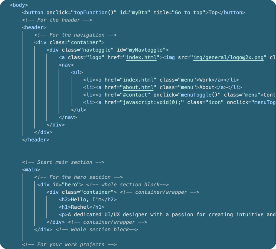
Phase One
Structure and content
HTML
Phase Two
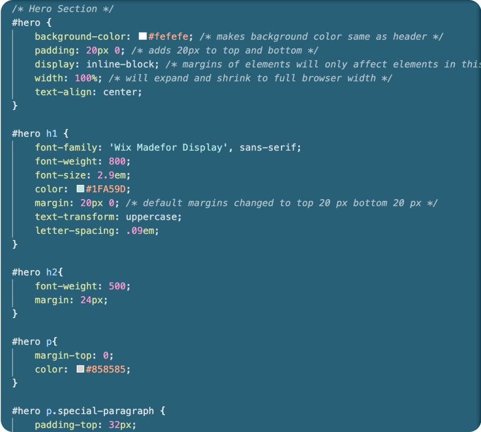
Styling and responsiveness
CSS
Phase Three
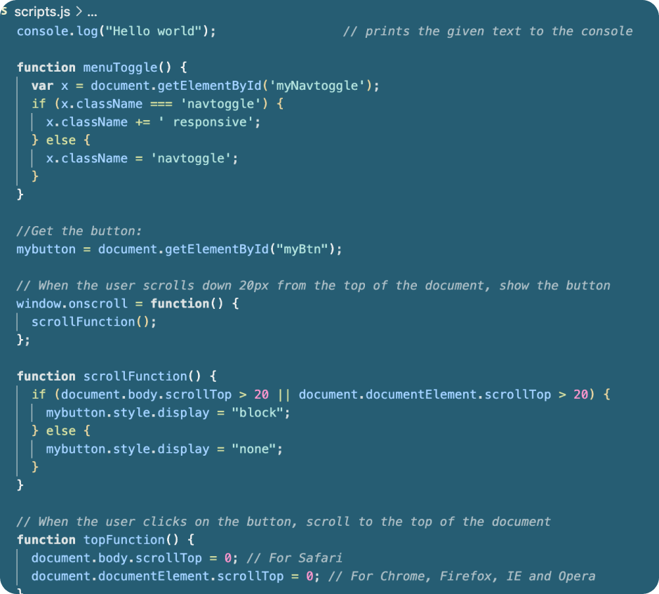
Interactivity and dynamic content
Javascript
Usability Testing
A usability test was conducted for the first iteration of the responsive portfolio website. A total of five participants were involved. Out of the five, three participants tested the website on a laptop or desktop computer, while one participant tested it on a tablet, and another participant tested it on a mobile device. The participants were given scenarios where they assumed the role of a UI/UX hiring manager who came across the portfolio website. The participants were assigned four tasks to complete on the website and given open-ended follow-up questions after the tasks. Participants were encouraged to provide feedback during the test session.
Goal
Assess the usability of the website across different devices, access user feelings about the design, and spot any errors or problems on the site.
Tasks
- View the designer's first presented project and extract important details about the project
- Discover background information on the designer
- Access the designer's resume
- Find a method to contact the designer
Results
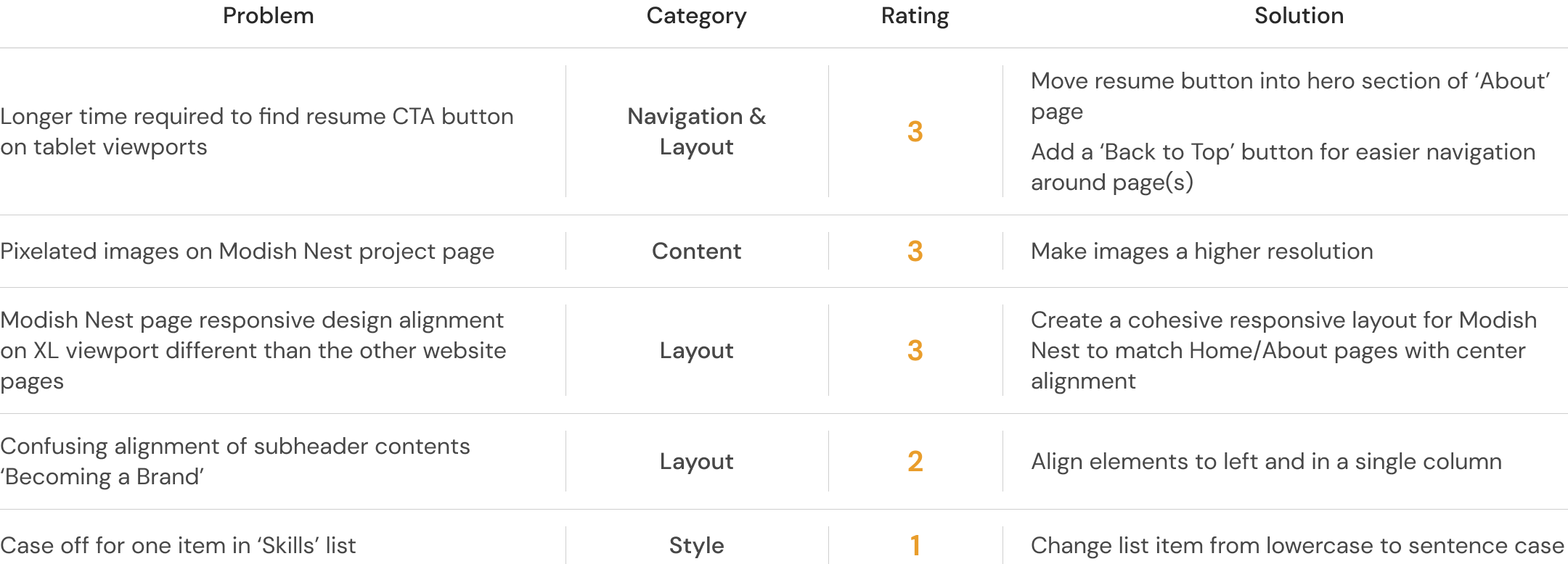
Participants found the navigation intuitive but encountered issues on mobile and tablet. Positive feedback was received for the typography and color palette, with no accessibility concerns. While participants expressed overall layout satisfaction, alignment issues on the Modish Nest project page and inconsistent responsiveness were noted. Participants successfully extracted important details from the content, appreciating the designer's profile image, though there were concerns. These insights provide valuable guidance for improving navigation, addressing layout issues, refining responsiveness, and enhancing content presentation.
Nielsen's Severity Rating Scale for Usability Problems
Quality Assurance Testing
Code Quality
Through the use of an HTML validator, as well as linters for HTML, CSS, and Javascript, code quality was verified for consistent and readable code error-free of misspellings and ambivalent syntaxes.
Cross-Browser
Mobile, tablet, and desktop breakpoints tested on Edge, Firefox, Safari, and Chrome. All four browsers encountered the same issue for the navigation bar on tablet and desktop viewports. The issue was solved by updating the CSS and HTML.
Accessibility Colors
All colors passed the AA standards, except for any elements styled with the accent colors I had set. To solve this, I manipulated the accent colors to meet the AA contrast ratio standards.

Style Guide
Colors

Typography

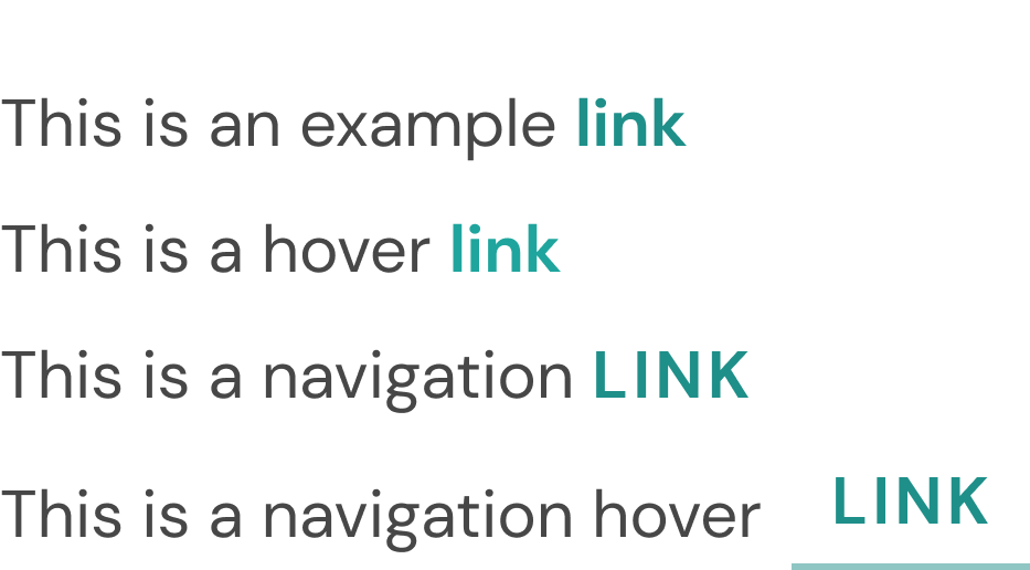
Links
Buttons

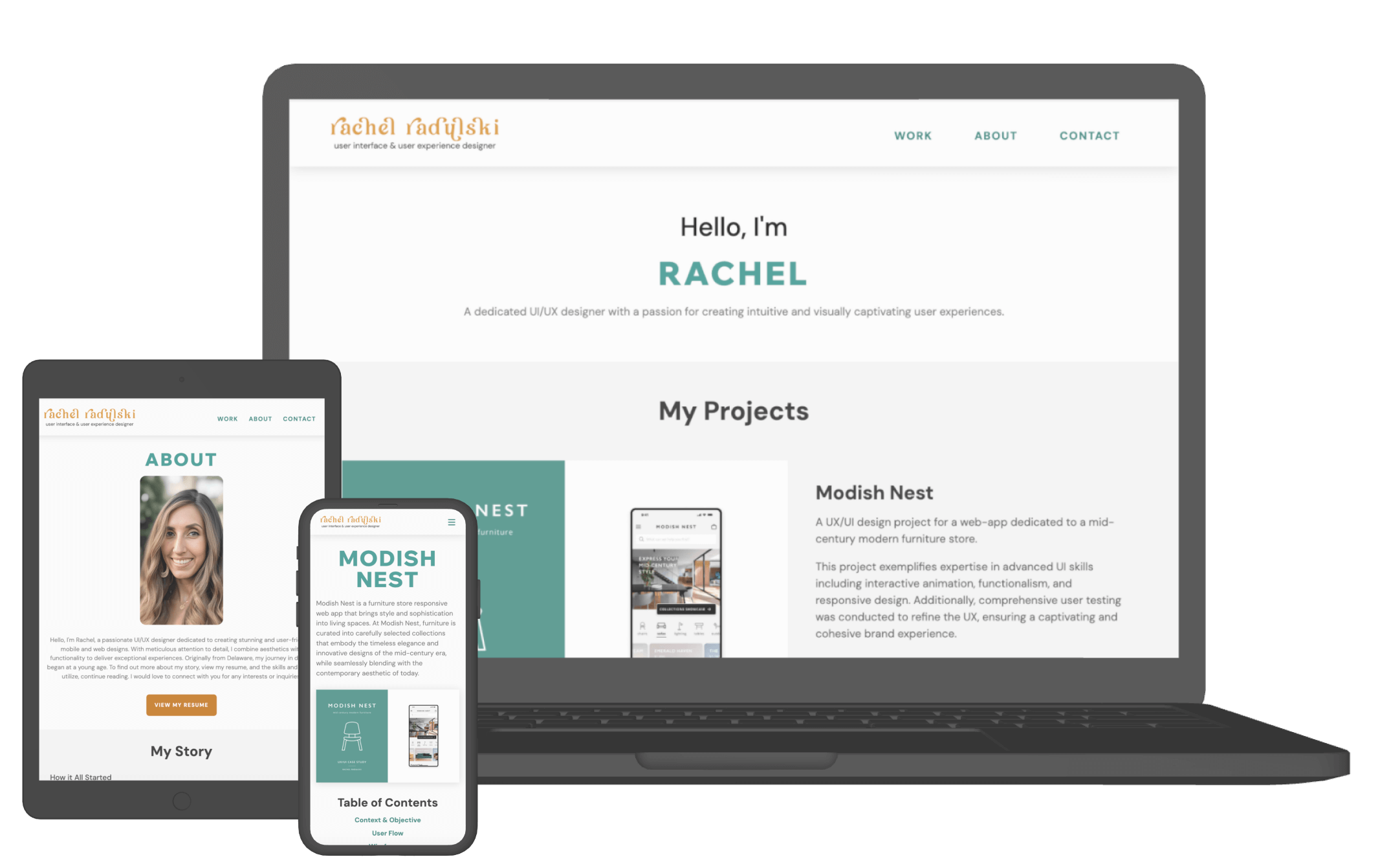
Final Designs
Achievements & Learnings
Project Challenge & Achievement
Creating a personalized portfolio website posed the main challenge in this project, as I aimed to showcase my UI/UX design skills and elevate my professional presence. Through user feedback and testing, I achieved significant results, gaining insights into the positive user experience, validating successful UI elements, and curating valuable content for hiring managers.
Iterative Design & Skills Enhancements
The iterative design process, influenced by user feedback, allowed me to refine the layout, address alignment issues, and enhance responsiveness. Accessibility testing ensured inclusivity. I strengthened my skills in HTML, CSS, JavaScript, and responsive design, combining UI/UX principles with front-end development for a cohesive user experience.
Gratitude & Future Endeavors
I express gratitude to my mentor for his guidance and support throughout these six weeks. I am proud to say I can think from a different perspective when designing, which was not unlocked before I took on the challenge of developing this portfolio website from the ground up. Moving forward, I am eager to continue learning front-end development skills by learning more about Javascript through online resources and putting my skills to the test on additional websites.

