Home Boost
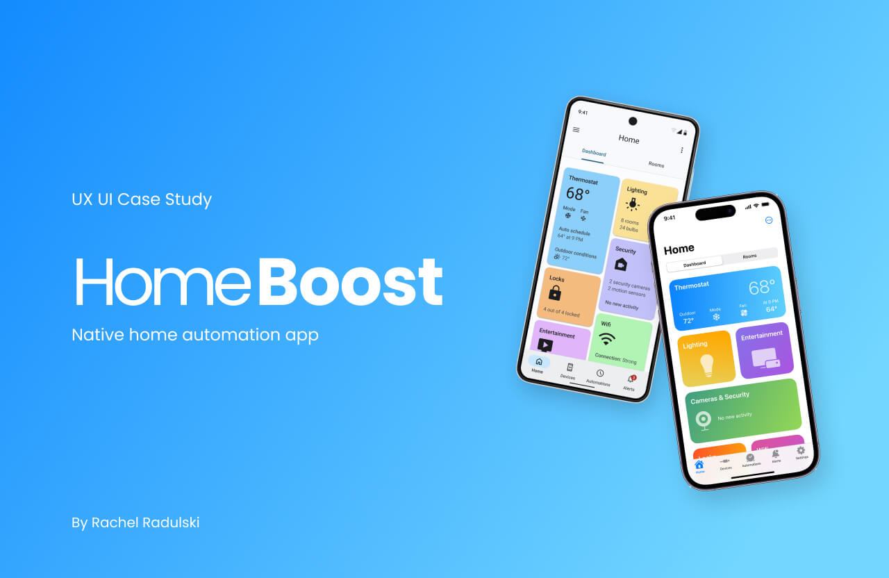
HomeBoost is a native home automation app for Android and iOS that allows users to control and manage their smart devices, create automation, and receive real-time security alerts.
My Process
Users
Designed for tech-savvy homeowners and tenants who want to conveniently automate and control their homes using their mobile devices. It caters to both experienced users and novices in the field of home automation.
Key Features
- Smart device management
- Automation scheduling
- Real-time monitoring and alerts
User Problem
Existing home automation apps present challenges for users who want to automate their smart homes through mobile devices. These apps often have complex and time-consuming setup processes, unfriendly interfaces, and inconvenient layouts, resulting in user frustration when managing and controlling multiple smart devices.
Goal
Provide homeowners with an easy and convenient way to automate and control various aspects of their homes, such as lighting, temperature, security, and entertainment systems, using their mobile devices.
Solution
Design an intuitive native app for Android and iOS that integrates a wide range of smart devices, allowing users to create personalized automations, receive real-time alerts, and manage their devices effortlessly from a single platform.
Design Approach
- iOS and Material Design Guidelines followed
- Appropriate use of color
- Utilization of native mobile design patterns
- Annotation of user gestures
- Clearly defined typographic hierarchy
- Designed for accessibility
- Intuitive and consistent UI across all screens
- Appropriate haptic sounds and feedback


Competitor Analysis

Features
SmartThings and Google Home offer distinct features. SmartThings focuses on iOS-influenced design with variations between iOS and Android versions, while Google Home emphasizes a minimalistic layout with accent colors.
Patterns
Both platforms employ minimalistic designs, with SmartThings utilizing white, grey, and blue accents, and Google Home emphasizing hierarchy and color indicators.
Layouts
SmartThings and Google Home have different layouts. SmartThings follows an iOS-influenced design with variations between iOS and Android versions, while Google Home features a minimalistic layout with light mode and accent colors.
Styles
SmartThings maintains consistency in its styling across different versions, while Google Home presents a minimalistic look in Light Mode with a variety of accent colors (transitioning to a single accent color in the future).
User Flow
Tasks
- Change thermostat schedule
- Adjust smart light brightness
- Initiate an emergency response from a notification

Low Fidelity Wireframes
iOS


Android


Platform Research
Foundations

Patterns

Styles

Components

Mid-Fidelity Iterations
Iterations made to mid-fidelity wireframes based on critiques and continued research on iOS and Material Design standards.

Uniting the Platforms
Recognizing the Problem
Material Design integrates dynamic color within its style guidelines. While developing my color scheme, I drew inspiration from iOS system colors. However, I encountered challenges when adapting individual colors to a Material Design color scheme. I had to find a solution to apply colors to my Android design that maintains coherence with the iOS version, while also adhering to the principles of Material Design.
Finding a Solution
Research
Material Design color scheme, mapping, and tokens
Utilization of Tools
Plug-in Material Theme Builder generates dynamic color schemes based on custom color inputs.
Adjusting the Outcome
Refinements need to be made to assure there is harmony between the generated colors and with the iOS version of HomeBoost.

High-Fidelity Wireframes
iOS


Android


User Testing
5 testers, a mix of iOS and Android users, participated in in-person or remote user testing. They were given prototypes tailored to their respective devices and asked to complete 3 tasks while providing feedback on design, flow, and any issues. The objective was to gather insights for improving the designs before finalization. Tasks included adjusting thermostat schedules, smart light brightness, and initiating security alarms from notifications.
iOS Results
Problems
- Thermostat: needed help finding the button to change the schedule
- Thermostat Schedule Editor: time picker on lagging when attempting to change
Suggestions
- Thermostat: have a start and end time in separate tabs to make it clear what the schedule is
- Lighting: could include a slider to adjust brightness along with the on/off toggles
- Lighting Room Control: pressing the “Save” button should keep the user on the current screen
- Security Camera (parent): include a button for alarm activation vs having to flow through a menu
Android Results
Problems
- Thermostat & Lighting Room Control: the bottom half of these screens felt too busy with the number of buttons
Suggestions
- Top navigation bar: change hamburger menu to app logo
- Thermostat & Lighting Room Control: replace the bottom row of buttons with the middle row of page-specific actions include a button for alarm activation vs having to flow through a menu
- Security Camera: show all 3 actions immediately in the bottom sheet, instead of having it be dragged up
Design Solutions


Final Designs
iOS


Android


