Modish Nest
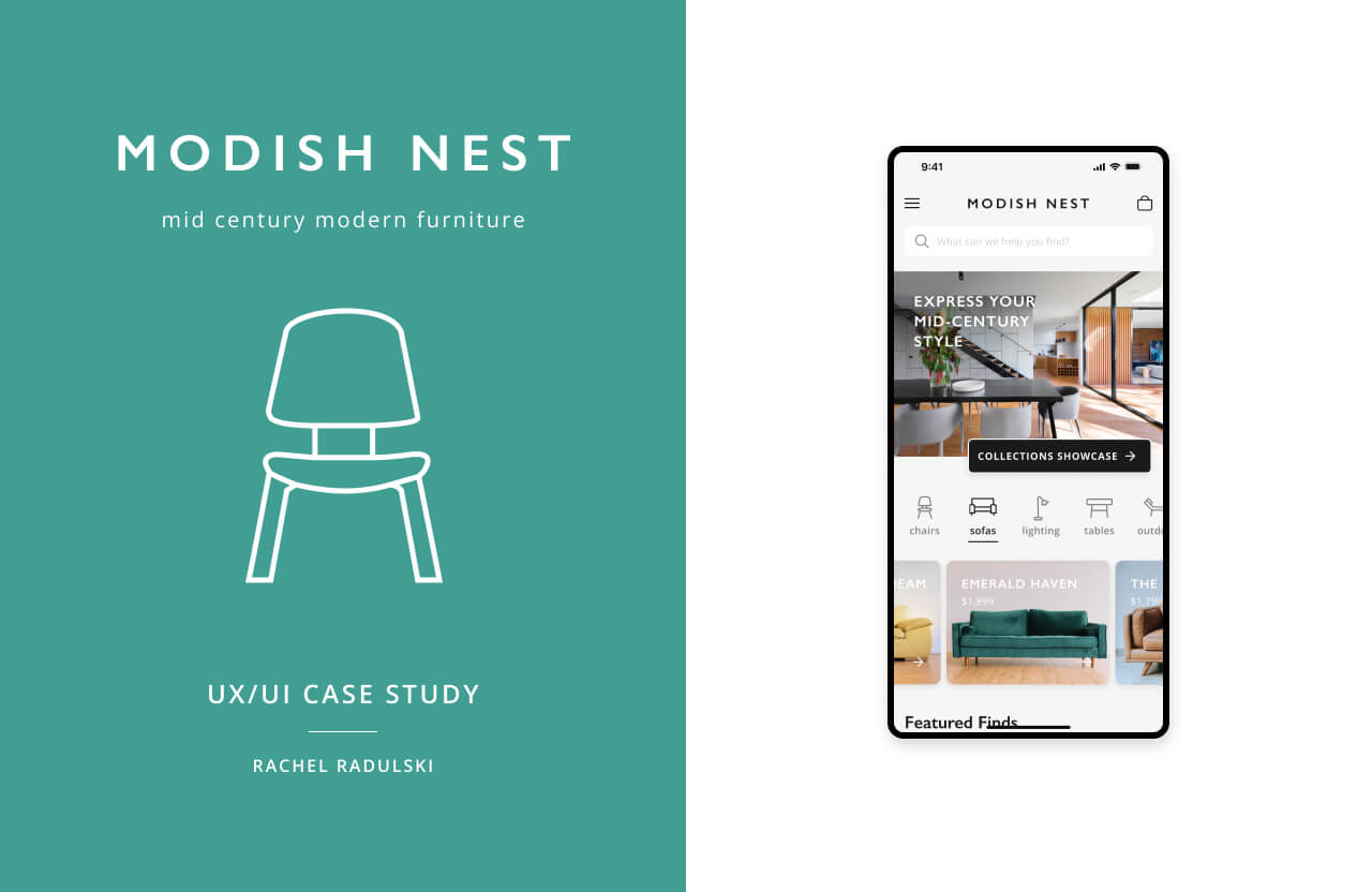
Modish Nest is a responsive web app for a furniture store that brings style and sophistication into living spaces. At Modish Nest, furniture is curated into carefully selected collections that embody the timeless elegance and innovative designs of the mid-century era, while seamlessly blending with the contemporary aesthetic of today.

Table of Contents
My Process
Objective
Develop a user-friendly online shopping tool for mid-century modern furniture.
Audience
Adults aged 25 to 45 who prefer online shopping due to time constraints, difficulty finding desired items in physical stores, and the convenience of trying out and returning products without the need for in-person visits.
Time & Accessibility
Users can conveniently shop from anywhere with an internet connection during various time frames. This could be on a mobile device or desktop, on a lunch break or weekends, or on the go.
User Problem
Furniture shopping in physical stores can be challenging for users due to limited availability, time constraints, and confusing navigation systems. Additionally, returning items in person can be a hassle. Online furniture stores also pose difficulties, such as limited product visibility, misleading item representations, complicated return processes, lack of personalized assistance, and overwhelming home page designs filled with excessive product displays and ads. These issues make it harder for users to have a smooth and enjoyable experience while searching for and purchasing their desired furniture and decor pieces.
Goal
Make it easy for users to effortlessly browse through a wide selection of mid-century modern furniture, discover new items, find products that meet their needs, and complete transactions and returns with ease.
Solution
Develop a seamless and accessible responsive web app that simplifies the shopping process for mid-century modern furniture. The web app will offer a wide range of furniture and decor products, provide a user-friendly interface for easy browsing and selection, facilitate secure online transactions, and offer hassle-free return options. This solution aims to enhance the convenience and satisfaction of users while shopping for mid-century modern furniture online.
User Stories
- “As a new customer, I want to access the inventory without having to register, so that I can make sure this store has what I’m looking for before having to create an account.”
- “As a customer, I want to have access to advanced filtering options, so that I don’t have to browse through a lot of products to find what I’m looking for.”
- “As a returning customer, I want to be able to save items that I cannot buy to a wish list so that I can purchase them at a later date.”
User Flow

Low Fidelity Wireframes
“As a new customer, I want to access the inventory without having to register, so that I can make sure this store has what I’m looking for before having to create an account.”
Mobile


Desktop


Mid-Fidelity Wireframes


User Testing
To begin user testing, I conducted a preference test with three participants aimed to create a user-centric design aligned with the target audience's tastes.
Home, V1

Home, V2

Home, V3

Home, V4

Home, V5

Collections, V1

Collections, V2

Collections, V3

Collection Detail, V1

Collection Detail, V2

Results
Home

Collections

Collection Detail

Quotes & Suggestions
- "I like the simple screens. The second collection version is confusing”
- Collections: “I am between versions 2 and 3 since I like the idea of a bigger image”
- Home V3: “Make the first image shorter, more like a banner, and move the icon set and carousal images up so it is more accessible”
Design Solution
Home V3
Before

After

Becoming a Brand
Philosophy
Curating timeless mid-century modern furniture that reflects your unique style and tells a story of quality and innovation.
Writing Style
Our clean, vivid, and customer-centric language captures the unique features of our furniture, allowing users to envision it's aesthetic and functionality and understand how our furniture brings them comfort, style, and sophistication.
Colors

Typography

Custom Icons

Logo

Imagery


Final Designs


