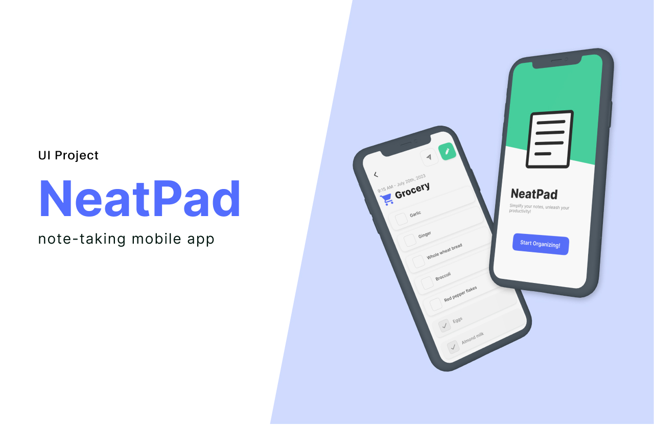
Neat Pad
For a rapid design project, I tackled the creation of high-fidelity wireframes for a note-taking app. The primary aim was to embody functionalism and craft an uncomplicated yet refined user interface, aligning with the concept of "less, but better."

Table of Contents
My Process
Project Overview
Specs
Role
UI designerDuration
One day sprintTools
Figma
Context
In response to a hypothetical urgent design request, I swiftly shifted focus from an ongoing project to tackle a time-sensitive task to designing wireframes for a note-taking app.
Objective
Create high-fidelity wireframes for a note-taking app with a "less, but better" design approach, adhering to functionalism principles.
Solution
I rapidly crafted purposeful high-fidelity wireframes for five screens of the note-taking app, meticulously adhering to the principles of functionalism. This resulted in a streamlined and visually cohesive design, ready to present to potential investors.
Final Designs


